Traveling With Wet Oil Paintings

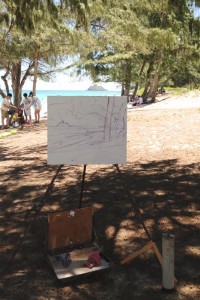
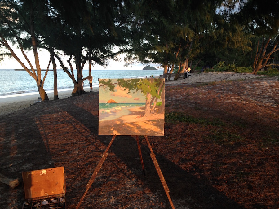
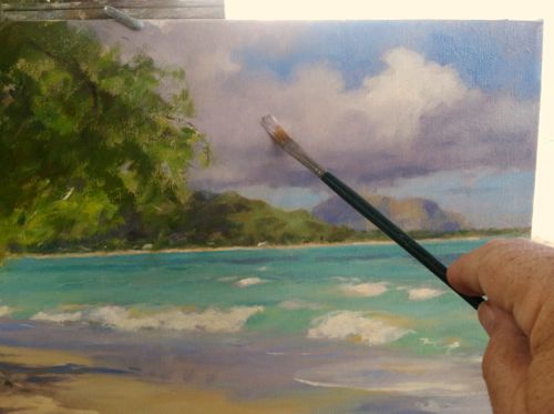
When traveling, no other activity in painting brings me more excitement than taking my old pochade box outdoors in search of a new motif to tackle.

Being a Hawai’i resident, trips to the mainland are welcome opportunities.  I can paint in situations where the visual content is rich in different ways than at home. The architecture, color, climate, citizenry…all offer a fresh point-of-view.  I love carefully scouting out a spot where I can unobtrusively compose and paint a sketch.

But when working in oil, there’s also a serious practical matter involved. How can we get damp paintings home safely with minimal expense and fussing?

Here’s what I came up with.

Divide and Conquer

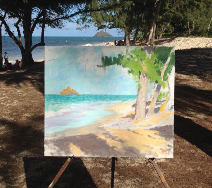
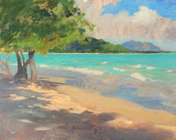
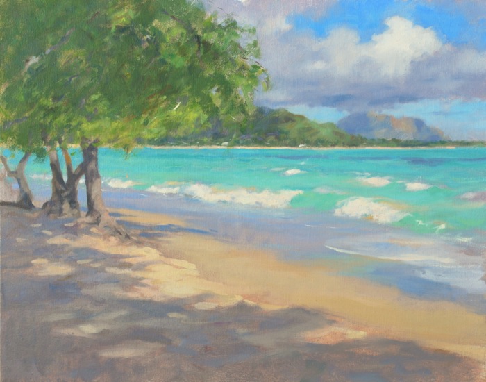
For this to work, the oil sketches need to be the same dimension. Fortunately, I only brought the size panels that fit my box, so all are 8 x 10″.

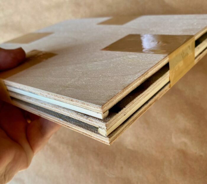
In this image, the paintings are numbered from earliest (1) to latest (3).  When it came time to pack, painting 1 was sufficiently set-up

My three fresh paintings, in order of dryness to the touch.

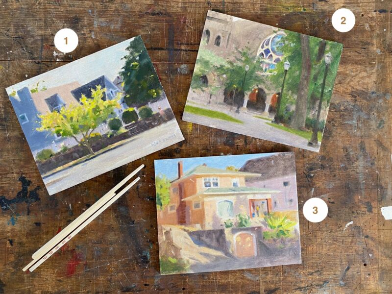
as far as being dry to the touch. It was the least vulnerable to damage. 2 was still soft, but was fairly set-up as far as dryness to the touch, being about 4 days along in drying. Painting 3 was the wet one, and so became the big concern among the paintings as I packed them.

Just a note…I don’t use driers (or any other means) to accelerate the normal drying time of oil paintings.  Exposure to air circulation and normal daylight conditions are ideal.   That discussion is for another time, but I wanted to mention it here.

Enter the Bamboo Chopstick

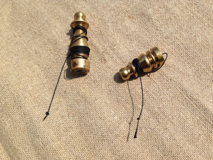
Being that I live (and eat) in Hawai’i, I’m used to disposable bamboo chopsticks as a part of routine life. When I needed to find a short, thin, readily available spacer to separate the paintings, I needed not look further. The ones we found are rectangular at the grip, ideal for use as spacers. Easy to cut if needed, they rest positioned on the painting’s edge, where the rabbet of the frame would overlap. That means any area of damp paint the chopstick might disturb would be easy to touch-up, and likely invisible once the paintings are framed.

The driest painting, upper left, with two bamboo chopsticks in place.

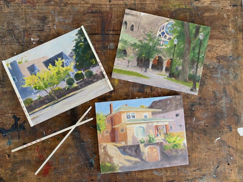
Using painting 1 as the base, I added a pair of chopsticks cut to the height of the painting, and placed them both along the edges on two sides. 

The second driest painting, top, resting over the first painting, separated. Two more sticks are in place, this time on the horizontal edges.

Next, I seated painting 2 on the platform thus created, and also facing paint-side up. There’s about 1/4″ between the paintings, which is great.

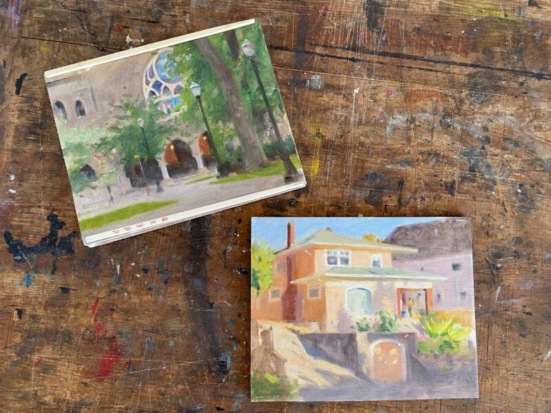
For painting 3,  wettest of the oil paintings, I faced it downwards. I was careful to seat it where the chopstick dividers would rest against the painting’s edges. Once positioned, I used some packing tape to bind the whole “sandwich” firmly together, as seen below.


The third and final painting, the wettest, is placed wet-side inwards. on top of the prior painting. The entire “sandwich” is then snugly and carefully taped into place with packing tape.

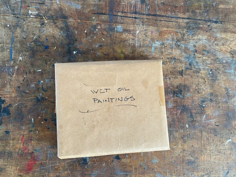
When this was done, it was only a matter of wrapping the combined paintings in some sturdy brown wrapping paper, and taping them closed.

Since I decided to carry them in my suitcase,  I took a moment to indicate the contents on the wrapping,  in the off-chance that my bags were opened for inspection.

Paintings wrapped and ready for my suitcase. On the off-chance that the bag is opened for inspection, I’ve marked the package descriptively.

I hope this is helpful to others. The whole process took about 20 minutes, and everything survived the flight perfectly.

Feel free to offer your comments or questions.

John Carlson’s Theory of Angles and Consequent Values-A Model

“Every good picture is fundamentally an arrangement of three or four large masses-“

So begins Chapter 1 in my aged copy of “Elementary Principles of Landscape Painting”, by John F. Carlson (now revised and available as Carlson’s Guide to Landscape Painting).

Like many others, I really admire John Carlson’s landscape paintings. I first encountered them face-to-face at the Grand Central Art Gallery in NYC.  And this was about the time I’d heard about his book, “Carlson’s Guide to Landscape Painting”.  But I have to say that when you see his work on a wall… it’s deep and it’s impressive. You know it’s the work of a painter who valued his craft and was genuinely responding to nature in a powerful way.  And that leads to paying much closer attention to what he had to say back in 1928, when his book was first published.  I can only hope that everyone who has read it might also, someday, have the chance to see his work personally.

John F. Carlson “Snow Lyric”, undated, oil on canvas 16.25 x 20.25″        Image courtesy of The Athenaeum

Carlson’s Theory of Angles and Consequent Values

One of the great practical lessons from the book is Carlson’s summation of how light affects the elements of the landscape.

He refers to it as the “Theory of Angles and Consequent Values”.  Carlson recognized that any landscape typically possesses four groups of values (degrees of light and dark) affecting three major planes… the horizontal ground plane, the angle plane represented by mountain slopes, rooftops, etc., and finally an upright plane, perpendicular to the ground plane, which can include anything from trees and walls to a standing human.

In order to interpret the landscape in a painting successfully,  an artist needs to simplify and organize nature.  Values are that which make form visible. Translating nature into value patterns,(i.e. grouping of lights and darks into shapes), are one of the ways of doing so.  Applying Carlson’s theory makes that much easier.

“The first two things to study are form and values. For me, these are the bases of what is serious art.” -Camille Corot

When daylight is overhead, as it would be at noon for example, the sky is the source of light and  therefore occupies the highest values on the gray scale. The ground plane receives the largest amount of light, and accordingly is the next lightest value plane. The slanted/angular planes receive  less exposure to direct light than the ground plane and so rest within a middle-value range. This  leaves everything in the upright plane to become the darkest value element.

While this is a wonderful help in creating order, it’s also a little abstract when read on the printed page alone.

A Model 

Because of this, I decided it would be easier to understand if I had a physical model, and over time I’ve built several. Most recently a student and I assembled one out of white foam core, which makes Carlson’s theory much more tangible.  I thought it would be fun to share with others who may want to repeat the exercise themselves.

The Carlson model assembled and drying

We added a small structure at an angle for additional interest, which isn’t from Carlson’s original description.

When finished and assembled ( using a steel ruler, an X-acto knife, acid-free Foamcore, and Lineco PVA glue), we put the model outdoors in daylight with the sun directly overhead.   The results are shown below.


The model outdoors in noonday light. The cast shadow is the darkest value, the ground plane the lightest.


Make An Artist’s Plumb Line

DSC_0111

For artists who draw with a plumb line regularly, here’s a nice addition to your box.

The tools of drawing are pretty simple, but over time have a way of becoming lifelong companions.  A well seasoned palette that fits the arm well, a mahlstick that’s been with you for years…these small things count for something in the pleasure and challenges of our work.

I began using a plumb line years ago.  At that time it was a simple arrangement of a small lead fishing weight and some black thread.  I still have my original from back when and it works fine,  but after seeing students come up with some awful makeshift contrivances (when I wasn’t looking!)  I decided to try and raise the bar for them.  This upgrade is simple to do and works well.

You’ll need a few things first.

Brass lampshade finials.  Check your hardware store for these.

Strong black thread.  Black reads best in multiple situations, the thread I have is of a similar strength to that of dental floss.  Upholsterer’s thread might be best.

Candle wax or paraffin. 

Electric drill and small bit (5/64th or smaller) and a vise or clamp.

PL 2

The brass finials are inexpensive and easily available, and also a perfect weight.

To begin you’ll need to drill a small hole after securing the finial in a vice. Enter with the drill bit from the threaded side, and drill a clean bore all the way through.  Brass is soft and pretty easy to drill.

PL 5

You should be shooting for holes like the ones below.

PL 6

Next, take about 20″ of your sturdy black thread and tie up a big knot of some fashion that is larger than the hole you’ve drilled. Thread the other end through the exterior hole and back through the finial, pulling it until the knot is snug against the brass.

PL 7

Next, pack or drip wax into the threaded end of the finial, adjusting the black thread so it is perfectly centered. There may be a better solution than wax, but it’s usually handy and works.  Let me know if you have an improvement to offer.

PL 9


Trim and tie off the end…I find 18″ of thread to be more than enough, and it’s better to be a bit long than too short. For storing, I just wind around the weight.

And now, you’re ready to go.

PL 10


October Sun

I’ve just finished this new oil painting after many interruptions, mostly weather-related. But I managed to shoot some sequential images along the way, and I hope you find the process and progress interesting.

Octobe Sun unframed
October Sun  Oil on hand-primed linen,  26 x 28″


Setting Up

Octboer Sun progress 1

My setup for starting.  I’m careful that the top of the canvas is perfectly level with the horizon, which you can see win the photo. I have a large pair of “Square Corners”, wooden right-angles, leaning against the right leg of the easel.  When used as a viewfinder, these help tremendously with visualizing the composition. They are a must-have for composing from nature like this.

October sun progress 1a

The drawing of the main lines, big shapes, and divisions of space on the canvas.

I start by placing a small x in the center of the canvas to build the composition around. Adjustments included enlarging the main tree in size from what nature provided, and moving the small island on the horizon to the far left of the canvas as a balancing measure. I’ve moved the horizon line up because it was too close to dead center.

All of this is important work and anticipates the end result I have in mind. Chances are good that anything I really dislike in the final painting is already taking root in a choice I’ve made at this stage. This part of the process can be done in one session, and an overcast day is fine for this step.  I prefer to have some time back in the studio with the drawn-in painting to view the composition,  preferably after leaving the location. That way I can be more objective about where I’m heading with the painting.

The composition is drawn in with a thinned mix of Ultramarine blue and Indian red and painted in with a hog-bristle round brush. I use a rag and a bit of Gamsol to wipe away any lines that need removing or adjusting.

Proceeding into Light, Shade and Color

Once light and color are introduced,  the painting sessions require similar light.  And as the painting progresses day to day, the window of painting time narrows to accommodate the specific effect I’m painting.

Octber Sun progress2

A photo taken after one or two sessions of light/color work.  You can see that I’m careful to have the canvas perfectly level with the horizon.  I’ve established the lightest note of light ( white of the wave) and the darkest dark (foliage in shadow) and every other value-note should fall between those two spots. This photo is taken AFTER the actual work was finished for the day… one must work when the easel is in shade, because working with direct sunlight on the canvas throws the values off, making the darkest notes appear too light.

IMG_1364

A long shot at the end of a session, close to the last one.  The painting is pretty close to being finished. This is after the light effect has gone, which is a delightful time to be with the painting and in the place after an hours’ s hard work. Notice I’m practically alone on the beach!

Framing 

While the painting is in progress, the other side of the effort is that I build and finish each frame for my paintings.  This work takes place on days when I have time to chip away at the framing task, often in the middle of overcast days, since most of my painting is either early  or later in the daylight hours.

26 x28frame

I enjoy building the frames and take pride in being able to make something that intentionally complements each picture.

OctSun fitting

Here, I’m fitting the frame around the finished painting.  I begin making color decisions for toning and finishing the wood with the painting in place. The frame will be sanded and shellacked for smoothness.

I first decide whether I want the frame’s effect to be darker than the dark notes of the painting, lighter, or somewhere in the middle. Dark makes the picture stand out (or”pop”, a word I don’t like!), but also can make the picture feel heavy in the room.  This is especially true in Hawai’i , where light colors and an airy feel are part of a desirable interior. I choose to go with a middle tone, picking up on the colors in the shadows.

Sun

And here’s the final painting. October Sun, 26 x 28″, oil on hand primed linen.  And currently available for sale.

Starting & Staying Fresh-An oil painting in steps. Part 3

The weather has been challenging; a hurricane was anticipated and this kept me off the beach for several days.  But, we dodged another one and so, thankfully, we’re back with good weather again.  And I’m happily re-engaging with this painting.

Staying fresh is a matter of exercising taste.  A composition has a point to it, a purpose…and if the artist identifies what the point is early enough, questions of what to include and what to eliminate in the painting are answered by whether they help or hinder the desired final effect.

I’m largely concerned with getting the feel of the light…I mean the color of  early daylight on the various elements, and making something beautiful with the composition by  leading the eye through the elements in a pleasing way. Everything I do, anything I add or subtract, should contribute to this purpose.

Here’s where I left off:

Second day's work

The composition is firmly in place and I’m satisfied that I’ve done as much as I can with the basic shapes.  This is, essentially, the painting in terms of design, that what we will irrevocably be “living with” in terms of the pattern of shapes. Today’s and future sessions will be devoted to bringing the painting up; that is, bringing things to life in terms of my objectives.

I’m also wary of overshooting the mark…one can lose the overall unity of the painting by getting caught up in parts and details, observations that don’t contribute but actually clutter the painting.  I’ll need to be very aware, especially when it becomes overcast for lengthy periods because  I can overdevelop an area while waiting for the light to return.

Resuming the Work

After setting up at my location, my first step is to address whatever area of the painting is most out-of- step with the painting’s progress.  In this case it’s the furthest area of the landscape, the sky and clouds in the right background.  Since I have a nice sky today I can easily jump in where I left off before.

The whites of the sky need to be adjusted down a slight bit from the whites in the waves, in order to keep them back in the painting.  This means graying them slightly.   So I mix a slight gray using Titanium white, Ultramarine, a red (Indian, Cadmium, or Light Red), perhaps some Yellow, usually ochre for this time of day,  and place this in the sky loosely.  By loosely, I mean I create a shade of the right value from these various colors, but do not mix them so completely that the colors  lose their individuality. This provides  a tone of a single value but with varied color temperatures in it.

loose gray

The clouds are in motion and the sunlight falling upon them is changing rapidly, so with this light gray in place over all the cloud masses, I can move shapes easily into a more satisfying design.  The effects of clouds on the demeanor of a painting is worth noting as they can help express many different moods. Clouds have a lot of personality! I refresh the blue of the sky with Cobalt blue, a thin layer brushed over the prior work.  With this I can paint edges of white and blue into one another, creating softer edges on the forms.

greying clouds

As I work on this, I eventually find myself over working an area, so I make a point of leaning away from the work (I’m seated) and actually keeping the seat at a distance from the painting so that I need to extend my arm  to paint. The idea is to keep me from getting nose-to-nose with the painting.  I also use an overhand grip on the brush, so that I can hold it with the brush handle cradled in the palm of my hand…this also keeps me back a bit more from the painting. And I try to move from area to area. Water, sky, shadow, light.  Moving all the areas slowly forward, but (hopefully) in a way that stays unified.  If an area is worthy of the eye’s interest , then I will develop it more carefully.  If not, I will try to simplify it as much as I reasonably can.

One of my main areas of interest is in the colors of the shadows in the foreground.  I find such areas to be quite beautiful in themselves. So I enjoy finding color combinations that work within the general value of the shadow, broken colors applied with varied brushstrokes that combine to create vibration of color like what I’m seeing.

As the session draws to a close, I’ve made changes in almost every area of the painting.  Lights and darks in the trees, enhancements of the waves and reflections in the sand, and more refined observations in general.

part 3 image

I’ll be writing another post on the painting soon.  Thanks for the coming along!

Barclay Easel Restoration

Barclay Easel restroation

PB270003

About eight months ago, I had the opportunity to acquire this beautiful old Freidrichs easel. It’s in good shape for it’s age, which I guess to be pre-WWII, though I don’t know for sure.  While doing some digging I learned that this is known as the Barclay easel,  designed by illustrator McClelland Barclay, who was quite the innovator in numerous ways.   The manufacturer  at some point changed it’s name from Friedrichs to the familiar (to artists) Frederix company.  It’s solid red oak throughout, and the crank mechanism works perfectly well.

I’ve  always  hoped to find something like this wonderful easel and bring it back into service.  When I discovered it, covered with dust and tucked away in a basement, I was delighted. Thanks again, Brad!

After a good amount of deliberation, I decided to strip and refinish the easel myself.  This is the easel in the condition in which I received it, the only real damage is a bit of termite activity that’s not threatening anything.  I’ll post some shots of the refinishing as it gets farther along.

In doing the research, Learned that this was the preferred easel of Norman Rockwell, and found many shots of him working at his. This is a favorite.

Rockwell Barclay easel
Rockwell painting at his Barclay studio easel