Halona Cove Oil~ Part One

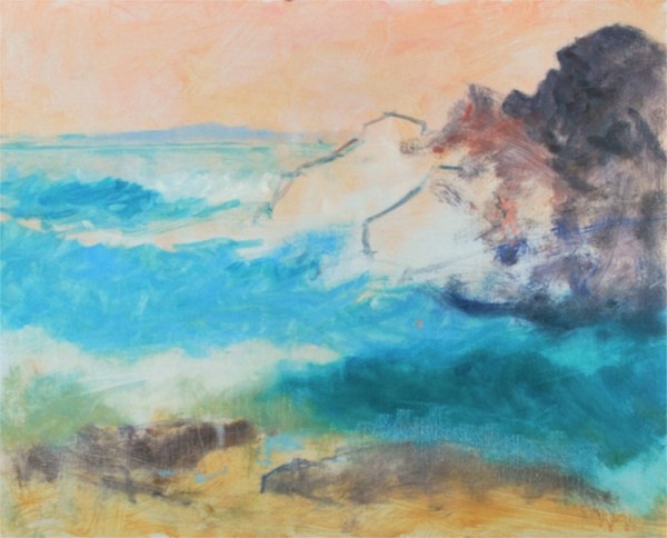
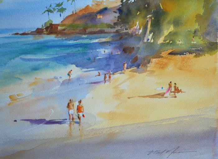
I’m really enthused over working out of this lovely cove again, and the watercolor (see previous post) was an ideal way to break back into it.

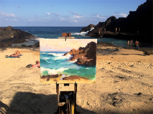
I like to paint with a goal for the work, and by that I mean a motivation or reason for pursuing it artistically.  This subject has distinctive elements and challenges that make it quite unique… it’s beautiful and it’s a bit dangerous here… and it doesn’t “pose” for me, it’s all in constant motion.  Very challenging to work directly from.

Opposites Attract

Consider lights and darks; in one glance you have the brightest of whites  in the light and the darkest of shadows,  for color there are warm earth tones opposed by our shattering blue-greens. Lines are jagged or curvaceous, or even perfectly straight. The masses are dense, bulky and immobile in the rocks, or fluid and streaming in the water.  Everything is in opposition, and  it’s all interconnected within itself.

So with all of this packed into one small area, it warrants my best effort.

My first composition, from the prior watercolor, has led me to focus more on the distant figures and the contrast they present against the rocks as that incredibly dark, end-of-day shadow quickly draws itself across the cove.

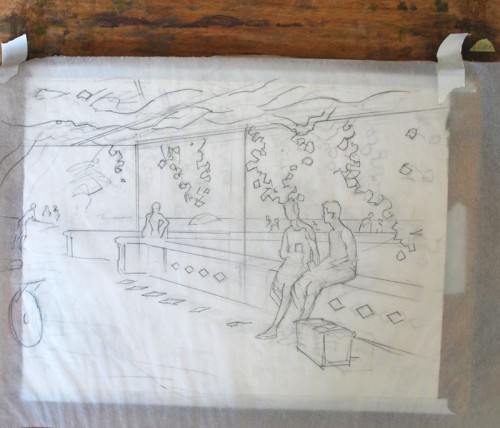
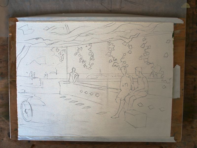
But before any of that, I have to design and place the big shapes.

Here’s the first afternoons progress:

Halona Cove, first lay-in 16 x 20"

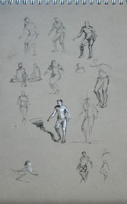
I worked until the light failed, after 4:00, and then made some mental notes of the figures that I observed around the rocks.
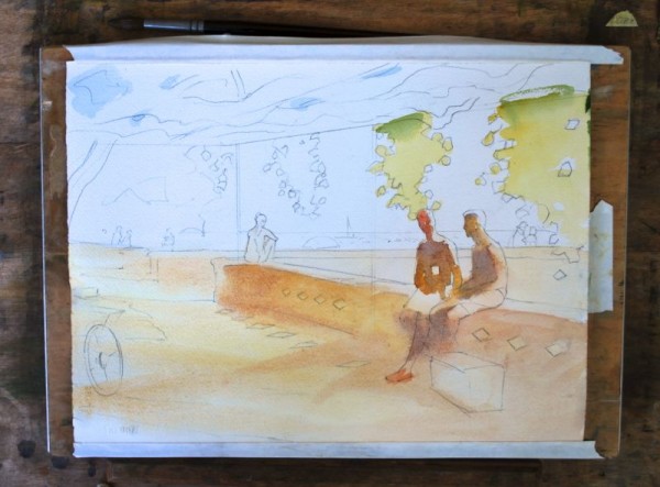
Back to work

I was fortunate to have several consecutive days that offered essentially similar light, so returned at the right time to continue on the painting.  This is a matter of seeing that large shapes are where I want them, and making certain that the color, which is perhaps one of the things I try to be most genuine about, is true to nature. The motion of the waves has to be thought through…the powerful white of the waves draw the eye by contrast, and I want them to create a rhythm that moves across the painting successfully.

Halona Cove ll

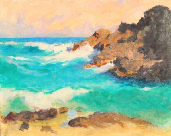
At this point I’ve begun to indicate a key figure, but haven’t yet made up my mind about the pose or position in the painting. Colors have developed another step, and the rhythm of the waves is being worked out.  I find that this stage is much more important than noodling the painting of the waves in a more precise manner…that sort of work won’t help a bad pattern.

This was a good afternoon’s work.

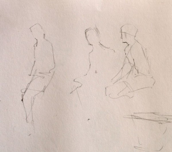
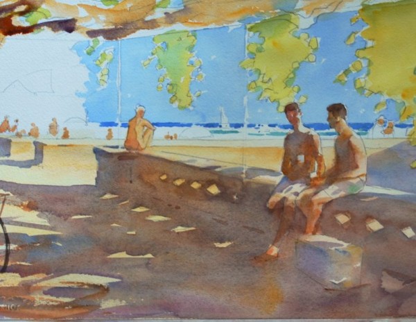
Working out the figures

I spent some time and sketched out some possibilities from memory.  Since they are tiny, I’m not concerned too much with the figures beyond their possessing an accurate sense of the light,  good proportions and gesture.

DSC_0001

Halona Cove  oil in progress, 16 x 20"
Halona Cove oil in progress, 16 x 20″

I’ll continue this post when I have more time!  Thanks for reading.

12/04/13 A Small Portrait Head

If you are at all interested in painting people, you probably will understand what I’m about to write.

Walking into a party last August, I was by chance reintroduced to this gentleman, Dr. Paul Brennan and his wife Dorothy. I will admit, and you’ll likely understand,  that upon first seeing Paul again from across the room, the painter-part of me immediately took to conniving and scheming about asking this fellow to sit for a portrait of some sort. How embarrassingly crass of me. I fought it successfully for a bit , but after getting reacquainted over a friendly conversation  with the two of them, I took the plunge and inquired (with understandably high hopes) as to whether he would be interested in sitting for my portrait class.  Thankfully he was willing and available, and in November we had the happy privilege of working with him for five three-hour sessions at the Honolulu Museum School of Art.


Paul Brennan

Dr. Brennan Oil on stretched linen, 14 x 11″

Though I worked on this while teaching, which means rather sporadically, it was still a pleasure to tackle this distinguished, noble character. With his vast interests and wealth of life experiences, Paul kept all of us entertained as we chipped away at our studies.

Simply painting a head adequately is challenge enough, and the skills in painting and problem -solving are acquired slowly and require honing. My own emphasis in this particular piece, which is only 14 x 11″, was to try to get at the truth of the subject’s color and to state the color notes as succinctly as I could, using the brush and knife as directly and expressively as possible, working towards surface interest and texture as well as light, shade, and color. I’ve been interested in some of the heads painted by artists such as George Clausen, where the verity of the likeness is equal with the knowledge that  you ‘re looking at pieces of paint. I find that to be a very rich experience.

Such little assignments within the task of painting the head keep me and the students on our toes and looking ahead to the next sitting.


A Studio Solution to a Plein-air Problem


Responding to a surprising  improvement

While working outdoors on a watercolor, I ran into a situation…a scene before me greatly improved as I was working by the unexpected addition of a pair of figures that were not part of the original concept.

Since I’d already begun applying paint to the piece, these characters couldn’t simply be added into the composition.  But I knew their addition would  make such a vast improvement that I couldn’t just let the opportunity pass me by.  I decided to make a completely new painting, but I knew that there would be no time to do so directly and at the location.

So, my first step was to sketch these two figures hastily in my sketchbook. These guys, who happened by and were now sitting only yards away, weren’t likely to cheerfully respond to a request that they pose for me, so I dashed them off rather secretly…their silhouette and relative position to the horizon…so I could place them into a new composition and have them be the correct size. I then made some mental notes, watching how they interacted, their posture, gestures, and so forth.

kaimanu sketchbook                     The sketchbook drawings

This accomplished, I was free to leave the location with a plan to start a new painting  in my studio the next day, relying on my incomplete painting, the new figures in the sketchbook, and hopefully some luck.

A Studio solution to a Plein Air problem

I have a background that includes having worked as an illustrator.  Illustrators are pragmatic artist/craftsmen and  accustomed to solving problems efficiently. They’ve developed a large playbook of applied techniques and one of the great tools of the trade is the use of tracing paper for refining and transferring drawings.

To shape the quick sketchbook notations into viable figures that would hold up in my painting, I would need to refine them from memory and a certain amount of invention. That’s where tracing paper came in….I created overlays of the rough drawings, gradually adding details from memory, refining and retracing until I had two figures of the correct size that expressed what I was after in the painting.  Because I did so on tracing paper, that stage of  work was all done without touching the delicate watercolor surface, which does not enjoy erasure and revision.

After a couple hours work, the elements of the entire composition were  combined on tracing paper and were ready to be transferred to the quarter sheet of watercolor paper for painting.

WC graphite

For this I used a simple graphite transfer sheet(above) that one can easily make themselves with graphite, a piece of tracing paper, and perhaps a bit of rubbing alcohol to liquify the graphite on the transfer sheet.  I placed  my graphite transfer sheet (graphite side down) between the securely positioned tracing paper drawing and the watercolor paper, and traced with a ballpoint pen over the original drawing.

kaimanu dwng 1a

The tracing paper cartoon positioned over the watercolor sheet. The transfer has already been accomplished, and is visible beneath the tracing paper, which has been moved aside slightly to reveal the transfer.

The next step was to fold back the tracing paper and strengthen the graphite transfer with the usual pencil work.  One can flip the cartoon back into position if anything hasn’t transferred.

Kaimanu dwng 2

The transfer on watercolor paper, strengthened with my customary pencil work

At this point I have a pristine sheet of watercolor paper with the drawing positioned exactly as needed, with all of the figures worked out adequately, and without any erasure damage to the watercolor paper.

I then resumed my normal painting sequence, beginning with the figures because of their difficulty, and moving outward and around from there.  I’m referring to the prior painting from the location for color and some details.

Kaimanu dwng 3


Kaimanu 4

And on it went!


“The Palm Courtyard”-getting closer to home

18 x 22″ oil on linen


I’m chipping away at the values and colors of this piece, getting closer to calling it finished. The sessions (about 6 so far) at the Honolulu Museum of Art have been a great pleasure for me, and I’m hopeful of wrapping up my work this week.

Along with clarifying the values,  I’m refining shapes somewhat, keeping lost edges lost,  and especially getting somewhere on the palm that is central to the composition.  Scraped down, repainted; it gets too picky in the details very easily, and I’ve had to take it all down on more than one occasion and redevelop it. The greens are so beautiful in life, I keep re-establishing them to get at some of the richness in the darker areas.  The foreground is only a bit more than layed-in, and doesn’t need too much more to my eye.

A thing suggested…a theme for the whole work maybe.

Whatever color the container in the right hand corner is, it’s beautiful to try and paint…a cool yellow in shadow, always tricky.

I hope to keep this painting light and open in feel, with the just the right amount of mystery… from value adjustments and color touches. It needs to look like paint, and I’m using the old three-part medium in this to get some richness and brushwork evident.


On my easel ~ “The Palm Courtyard”

“The beginner seeks to improve their paintings by adding details.
 The artist does so by refining relationships.”  
 -M.N.
The Palm Courtyard (working title) 18 x 22″ oil on linen

Thanks to the kind generosity of the Honolulu Museum of Art, I’ve been allowed to work on the Museum grounds in this very special location, the Palm Courtyard.

The courtyard  itself is one of several integrated into the Museum’s design, in this instance quite a large area with all sorts of compelling tonal, color, and light/shadow things happening. When I first entered it with an eye towards painting something, it was as if I’d stepped into a life-sized still life arrangement.

Composition ideas often come when I’m looking for “something else”, and this particular  arrangement caught my eye while setting up our model for my class “Painting the Model en Plein Air”.  Perhaps the biggest attraction was the momentary effect of light falling on the large palm  right-of-center (which at this stage of the painting is not yet developed) and the beautiful variety of shapes which I find lead the eye nicely.  Also, the full value range —  from bright, near dazzling light to near darkness…are a big challenge.

The painting is developing slowly…many trips to the location, and as a nice additional bonus, plenty of  interest from Museum visitors and staff alike.  A few have added a brush stroke of their own to the painting at my urging; I believe it’s good to let people experience the process and I enjoy doing so immensely.

As the painting progresses through increasingly subtle adjustments of color, shape, and value, I hope it will capture some of the very quiet richness of this easily overlooked courtyard.  As I stated at the outset, and teach my students,  the artist attempts to improve the work by adjusting relationships.


Tidepool: The Surge

It’s been good to stretch myself out on this large  (unframed size 28 x 36″) Tidepool piece, the first of what may become a series. Painting the unpaintable is what it felt like,.

I relied only on a fairly rough oil sketch and some pencil ideas for the design, which is what most of the painting ended up being about.  From there it’s been a matter of  adjusting things until they looked close to the way I wanted.

I’ve often found it to be a remarkably thoughtful experience to just sit in a place such as this, there are plenty of opportunities to do so in Hawai’i, and take in the indescribable concentration of energy and life that is here.  The colors are wonderful; every sense, really, is able to partake of such an experience, the sound and smells also, even the moisture against one’s skin, and I suppose that it hints at bigger things, questions of creation and how small a thing each one of us, in a sense, is.  All of this beauty and mystery occurs independent of us, whether we notice or not…imagine how much does escape our notice.


So now to practical matters.  I have a couple days to finish work on the frame before it gets hung.  Gallery at Ward Centre, after Friday the 29th, it will be on display. Come see.


A New Portrait Head ~Honolulu Academy School of Art Class

I’ve just finished work on a four-session portrait from a terrific local model, Sergio Janzen. This was done in my class as a demonstration/keep-the-students-enthused  piece.  18 x 14″ oil on stretched linen.

I say study, or even sketch, because there’s only so much one can and should do when students are present, they need help. At the same time I always try to teach by practical example… it’s much better, and certainly humbling, to be struggling with the same problems as they are rather than calling plays from the sidelines with a wine glass in my hand. And if one of the oil painters has a question, I can show them how to work out the answer on my own painting or theirs.  I think that’s an ideal way to learn


Red Sergio oil on linen 18 x 14″


It would have been nice to have had another 3 hours to work out some things on Sergio’s portrait, but I did some of that from memory after the sessions ended. I would rather work from memory in those instances, simply because it keeps me sharper.  I also am driven slightly nuts by the  number of people using cell phone photos to work from away from the model, but they just laugh and call me old  fashioned, which is somewhat true.

But I stick to my guns on this point, because the entire process is not, in the case of the student, to only “finish” a project, but to train their faculties, and one of those faculties involves taking three dimensional reality (nature) and recreating it in two dimensions (upon the canvas) without a machine doing it for them.

My palette was:

Yellow Ochre

Cad Lemon

Cad Orange

Cad Scarlett

Light Red

Flake White #1, with a touch of Liquin worked in

Alizarin Crimson

Viridian

Ultramarine Blue

Ivory Black


The New Watercolors for January


DSC_0014


Along with everything else I’m working on, I’ve been on a watercolor jag for the last month.  It’s been great fun and hard work, and I’m planning on more.

Do these work for you?

So much of painting is just about purposefully being in the work-mindset.  Rather than waiting to be inspired,  often times I just have an idea about  design, or an effect of light, and begin with something in my sketchbook;  inspiration or enthusiasm arrives after I begin to work, not generally before.  I know it’s the same for writers and musicians…you begin by taking the first step of working.

Each of these paintings are quarter-sheet, which is watercolorist talk for 11 x 15″, and painted on Saunders #200.  Titles are coming.