
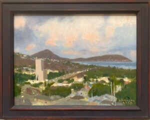
This particular painting has had some reconsideration since I declared it finished a while back. As I always like to do, I gave it a rest by putting it out of sight, moving on to other work, and returned to reappraise it objectively after some time had passed.
In this instance, I decided that it was falling short of what I was after.
I find the effects of light, color, and motion in Hawai’i to be so beautiful, in and of themselves, that I’m very conscious of the danger of caricaturing those aspects. One sees that enough…exaggerated colors and stereotyped images of the sea, drained of any actual reality or meaning, as if the artist has lost contact with the subject.
While I never felt I was running that particular risk, I found that there were improvements to be made in the color of the water, which was running a bit too green, and some compositional additions that would be positive .

Sunlit Surf- Lana’i Lookout Oil on Linen 24 x 32″
I made some appropriate adjustments in the color, some additions in the foreground and the introduction of a white wave in the background on the left horizon, which adds more of an incentive for the eye to travel there. Finally, I noticed a very pale, waxing crescent moon one evening, and decided that if painted very subtly it could be a beneficial addition. I’m now much happier with the piece and am willing to let it rest for final varnishing and to be framed.

4 Comments
Hi Mark. I loved this back in October when you thought it was finished. I love it even more now. Hope your Christmas was wonderful and your new year has begun well.
Hi Rhonda,
Thanks for that. This painting went through a difficult adolescence. Not every painter has this a few miles from their studio, and it’s a privilege that deserves the best I can give it. From the artist’s viewpoint, paintings always seem to fall short somehow, but the blessing is that you learn something and can try again, which I will.
Best to you guys!
I was at a loss as to how to apply the thicker paint. I saw your palette knives and was encouraged somehow. I saw they were more rounded and smaller. I think I might give them a try once I make it to the store. I tried a couple I have and them tried to use a brush along with them but not getting the affect that I want.
Hi Susan…building up a body of paint for a studio painting (one done over a period of separate sessions) or in a “premier coup” (where you are going straight after the effect immediately, no tinkering around with it afterwards) requires, basically, “fatter paint”, which is pleasurable to work with and creates surface interest. I tend to work sparingly in the way of painting mediums personally, but if you want to experiment, dedicate an old canvas or panel for experimentation, and when you have leftover paint at the end of a session try various things out on the canvas with the extra paint. Pile it on, move it around in ways that you find appealing, glaze over it, and make notes on the canvas so you can see the effects of different mixtures long term. If cracks appear or paint flakes off, etc. you’ll need to be able to figure out why, and the notes will be there for you. This way you can practice with knives and different brushes and go after effects to your heart’s content without risk.