
 Fifth day’s painting
After some delays, I have images from the last two sessions.
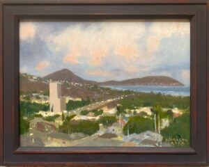
There has been more work in every area, beginning with a scumble over the foreground water of Viridian mixed with some Cerulean blue. This allows me to deepen the tone, which needed to go a bit greener, as well as giving me a thin layer of fresh paint to work into. From there, I brought down the shadows in the whites of the waves to a deeper value, and added more warmth to the whites with the addition of Cadmium Scarlet and some orange and yellow as well. I’m still utilizing my original plein air sketch as a guide for color, as well as other sketches from that area and my recollections.

I love building these whites slowly, adding a bit of linseed oil in the impasto areas, and developing texture in them with some selective painting- knife work. I admit I originally was a bit biased against the use of painting knives, associating them with method-painting approaches, until I became aware of some marvelous effects in older landscapes (William Lamb Picknell easily comes to mind). These were strong effects that I couldn’t get with brushes, and so I decided that I’d better get of my high horse and start making use of them.
I needed simplicity and roominess in the sky to create some relief for the chaos in the water, but at the same time the strong warm notes of orange in the low lying clouds were great to complement the blue-green sea mass. The clouds I chose to paint are simple, directional, and typical of that time of early evening. I’ve allowed a bit of the warm undertone of the sky to show through the pale blue, which lends a subtle vibration in an otherwise quiet area of the painting.
An interesting lesson in how I paint skies…we were members of a wonderful German church when I lived in Brooklyn NY, and they had some fabulous stained glass windows that had been imported from Germany back in the 19th century. I noticed that to get a particular sky effect, the glass artists had cleverly juxtaposed various pieces of warm and cool blue of the same value against one another, in varying sizes, which from a distance gave an optical color effect unobtainable had a single blue been used. That’s an idea I’ve used since then, placing brushsrokes of varied blues of identical value side by side.
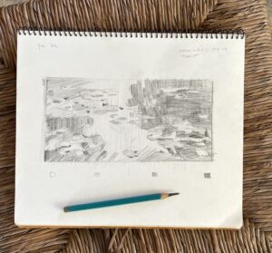
Here’s a reminder. It’s good to see how far things have come since the original sketchbook drawing of late August.

No comment yet, add your voice below!