

We know that with practice, most artists will get a handle on “how” to paint the parts of a picture. But the composing of pictures is a different task…one that requires experimentation, sensibility, and the development of taste. And the question is…where do we find those tools?
It’s good question. Here’s where that question has led me.
There’s a Power of Pattern
In my own long search to learn how to compose (meaning “organize a painting well”), I saw that I’m drawn to certain pictures by some vague attraction that I can’t account for. An example was that while flipping through the images in art books, something was making me stop and go back to something that flashed by my eyes in a moment, even though I’d only had the briefest of glances. Over time I was able to figure out that an overall pattern of a painting was the subconscious power at work.
Realizing this, I was able to eventually work out a simple method of analyzing the paintings I most loved, and then adapting what I’d found into my own pictures. The method is useful in studying the work of others, or designing one’s own compositions. I simply call it the 4 value study.
The 4 Value Study
This process takes the artist through the placement of the largest shapes first. This is the division of the canvas, so to speak, and these are the big initial decisions that eventually affect everything to follow. If you’re doing a study from a painting in a book or one in a museum, you will gain insights into how that artist has chosen. If you’re out in the field on a landscape o working with an interior subject, you’ll be planning in advance how the pattern might work, and preparing for less struggle in the long run. It’s often been observed that the regrettable decisions that are evident in a finished painting are choices made in the very first stages. This reduces that danger.
Also among the benefits are
- it can be done in a short amount of time, (in this example, about 25 minutes) with simple materials, and in your personal sketchbook. This enables you to easily review.
- The exercise has you retrace the original artist’s steps, because you start with the “big pieces” that make up the underlying structure. This puts you “looking over their shoulder” in the decision process, because they probably put their energy into the interrelationship of the main pieces.
- With only 4 values to work with, you must ignore details and and instead see the painting in terms of a pattern…that is an intentional arrangement of big values and big shapes. That’s part of what’s catching your eye to stop and look in the first place.
Where do I start?
Begin with a good painting from a good source.
Find a painting that you admire… a painting that you wish you had made. I sometimes look online, on sites such as Pinterest, and have particular artists I find especially beneficial. Their small studies are often in the same mix with their completed works and are great helps. Also, books and catalogs from museums, available free at the library, are a good place to poke around for images that impress you. But best of all is before an actual painting in a museum, which is a wonderful way to the most out of a visit. And nobody will mind your sketching in a small sketchbook. Other people will be interested/inspired to see you working.
If you choose a photograph, choose a photo in color rather than black and white. The advantage of color is that you’ll learn to read the value of color, which takes some practice, rather than having it done for you by a black and white reproduction.
The only tools I use are a soft graphite pencil (6B is good), and an eraser at the end for cleaning things up. And as I’ve mentioned, I like to mingle the 4 value studies in my regular sketchbook that I do my other work in.
Procedure
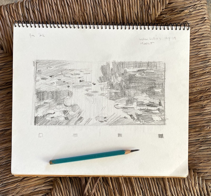
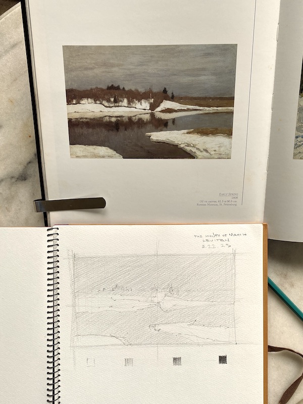
For the demonstration, I’m using my sketchbook and an image from a book. The painting is by a favorite Russian impressionist, Isaac Levitan. I picked it for its full value range (meaning from white to almost black and simple grays) plus interesting big shapes. He’s a favorite artist of mine, so why not get inside his head? What easier way to learn about his work?
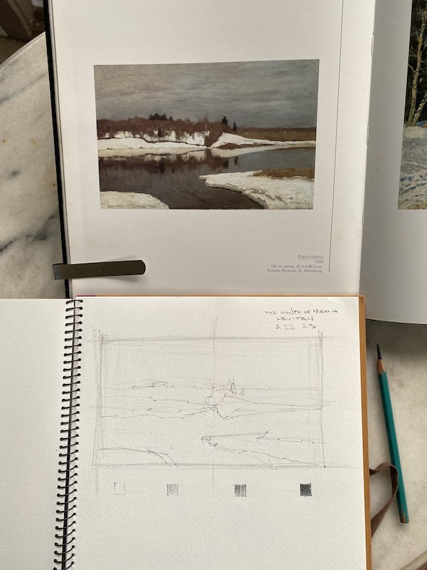
The art and the sketchbook positioned for easiest comparison.
In the image above, my sketchbook and soft graphite pencil are at hand, and the painting I’m working from is immediately in front of me at a comfortable angle. This is so my eye travels the shortest possible distance to compare the image and the drawing.
Part 1. How to start
A. Find the proportion of the rectangle that I’m copying. It needs to be the same proportion (size) as the rectangle in the reproduction. If you need to use a ruler, feel free. Notice the faint “crosshair” lines to show the center of the rectangle…and it’s okay of they are loose and sketchy at the start. This division of the rectangle will help p you tell where the shapes in the painting are.
B. Make a scale of 4 steps below the rectangle. Start by drawing a small white box, two more empty boxes, and then a very dark box, like I’ve done at the base of the drawing above. This is the outside range of our pencil’s ability to create light and dark. Between the black white box and the black box, create a light grey and a darker grey. Try to keep the steps between all four values even.
Important-everything within your drawing is going to be in one of these four values, even though you’ll see many more values in the painting. Your challenge here is to simplify the many values of the painting into four.
C. Start with a large shape first. The dark water forms a big shape, and the sky another, so I’d start with one of those. Try to place them as accurately as you can, and with a very light, sketchy touch. If you can do so very lightly, it’s a good advantage. Study the original and compare the big shapes to what you’re making, and adjust if you see something that looks off.
Once that’s established (again, with a light touch so you don’t have to scrub out dark lines when adjusting later), continue to outline the shapes of the painting. Sky shape, trees shape, snow shape, etc.
Some advice that will be very helpful..work from the largest first, lightly, then work your way down to smaller shapes. Disregard as many details as you can, they’re just clutter at this point. Add them after the big shapes and values are right.
Part 2. Getting the Light & Dark
Now it’s time to render the values.
To begin this step, take the lightest of our two grays and cover the entire paper with it…except what is to be white. This is what I’ve done in the image below. You can see what I did in the photo, and using light 45° strokes is the easiest and most natural way to lay down a gray. We’re “reserving the white”, much as a watercolor painter does… but everything else will at least be the second grey. So you can cover everything but the lightest shape with it.
Third Step
The addition of the first grey sets us up for the next, our darkest grey, which is 75% darker gray from the white to black. Since we’ve already applied our light grey over everything that’s not in the white value makes this step easier. Anything that’s not in the darkest dark or the lightest grey will be made of this, regardless of what type of object it happens to be. And remember, it’s only shapes we’re interested in, not any details.
One thing you’ll probably realize is that all of this requires you to make decisions about how to group things simply. Four values aren’t nearly enough to account for everything we see in a painting, but that’s the good part…we now have to forget about what things “are” in the painting and work as a designer…grouping values together regardless of what they represent (sky, water, hills, etc.) in the picture.
The reason you want this skill is because it will lead to freshness and clarity in your own work. And you can develop the skill in your sketchbook…it’ll change how you view painting for the better.
Final Step
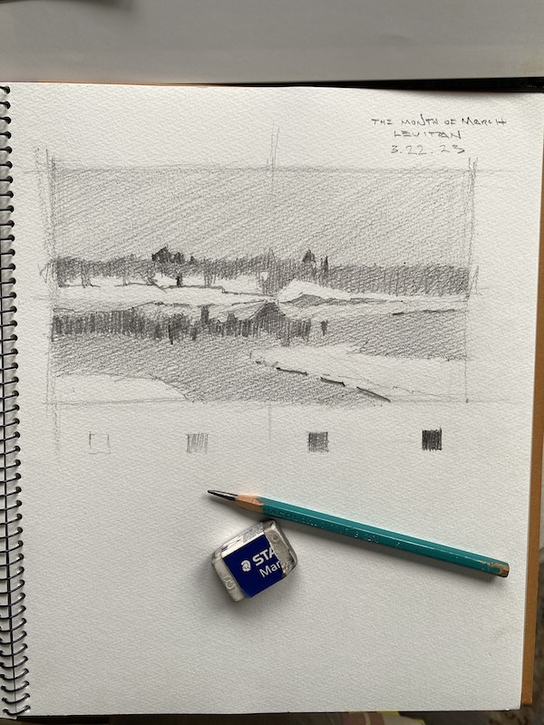
To finish, it’s simply a matter of adding the pattern of the darkest darks to the other three. This is where it’s advantageous to have used a soft pencil; it makes that darker value easier to apply richly.
After doing so, I finally clean up the whites a bit with my eraser, re-adjust the values a bit overall, and enjoy the drawing and painting. A light application of a spray fixative will preserve it for years to come.
Conclusion
One of the main task of the painter is to arrange and organize what you paint. Determine what’s important, and discard everything that isn’t. With this method and some practice, you can learn the thinking artist’s you admire put into their own paintings, which is information that you won’t get by just looking and admiring.
And finally, the greatest benefit comes when you are in the field working out a painting, or in a studio with a painting, this skill will certainly help you quickly determine your best design.
I hope you’ll give this a try…and would love to hear about your experience or any questions. Feel free to comment, and GOOD LUCK!