Right Under My Nose

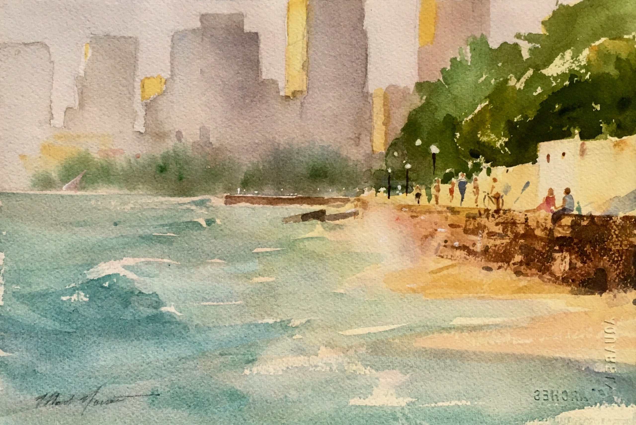
We live in a wonderful urban neighborhood in Honolulu called Kaimuki.  Seated on the backside of Diamond Head, it’s an enjoyable mixture of both modern and century-old homes, a funky/trendy business area, and a populace that includes most all of our island’s varied ethnic heritages.

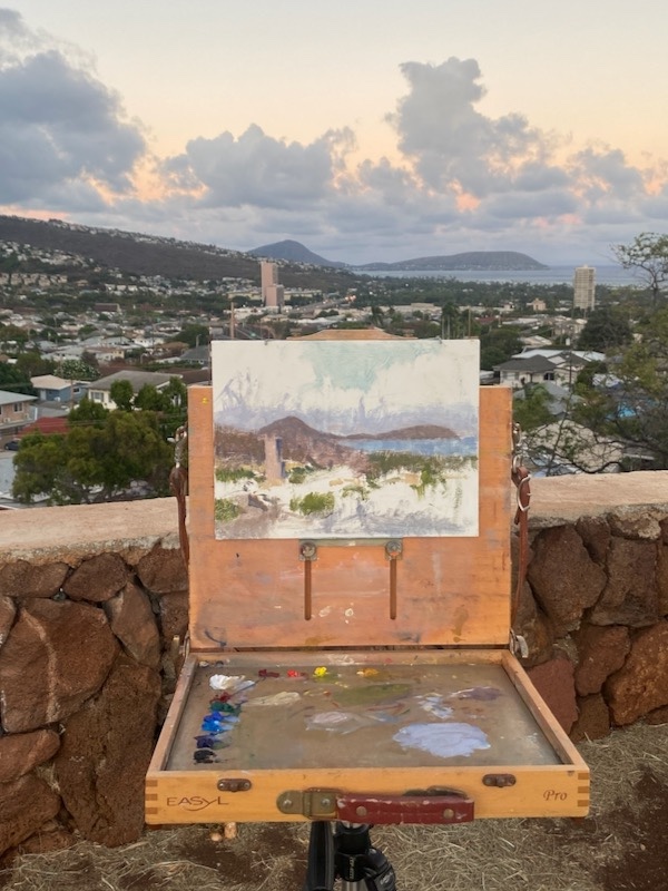
It’s also great for walking…rolling hills, old concrete sidewalks (with the occasional child’s handprint), and fresh trade winds that provide delightful comfort during an evening stroll.  One notable feature is a high, rocky point topped by a small park. Called “Christmas Tree Park” by locals, it’s just a few blocks from home, and during early evening it’s quite popular. There’s a group of dog-lovers who habitually gather, perhaps some first-daters trying things out, and a variety of others who enjoy the westward view over Honolulu at sunset.

While I’m not a regular, I do occasionally drift up that way after supper. And it was on such an evening that I finally decided to get started on the early-evening painting I’d been contemplating.

The Influence

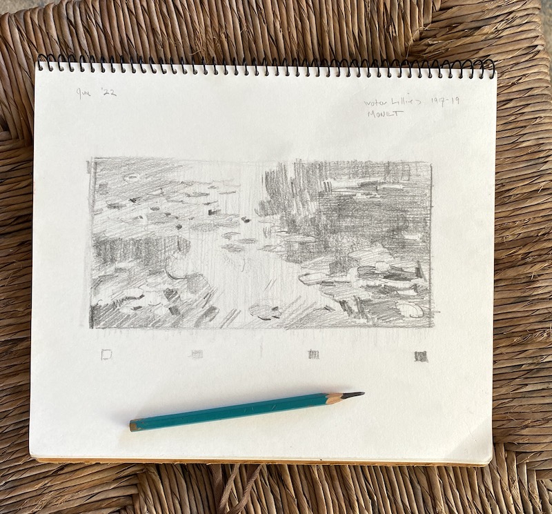
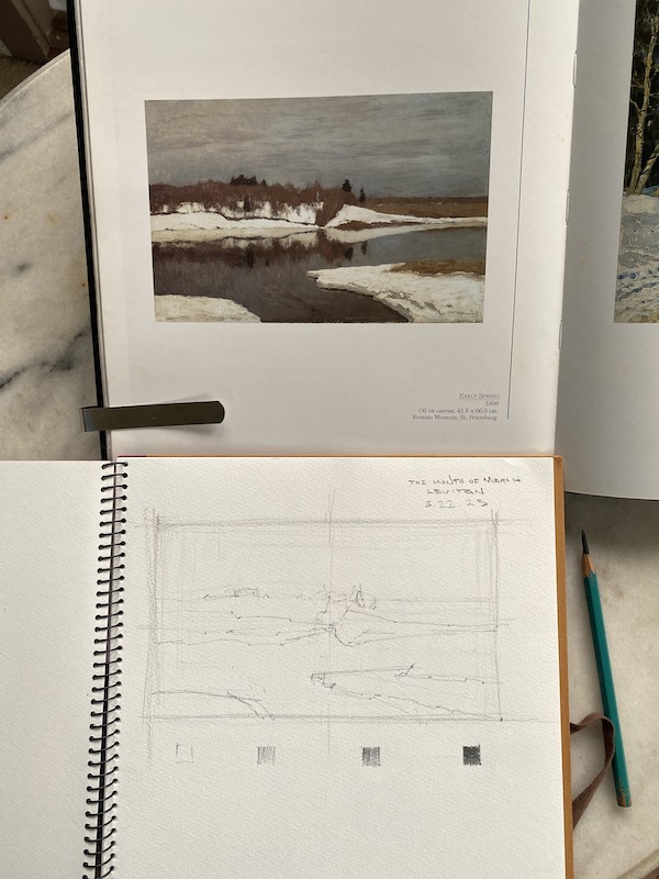
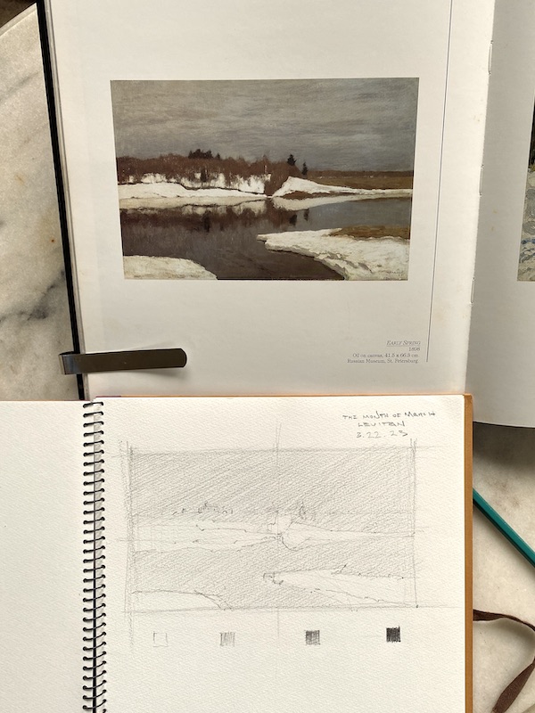
For years prior,  I’d been admiring a painting by the 19th century  Spanish painter Ramon Casas.  His was also a “townscape”, of Montmartre, painted as it appeared back in the Impressionist days.  I’ve always been excited by Casas’s picture; an interesting puzzle-pattern of darks and lights, rooftops, roads, and trees. It was definitely an inspiration for where I hoped my own picture could go. 

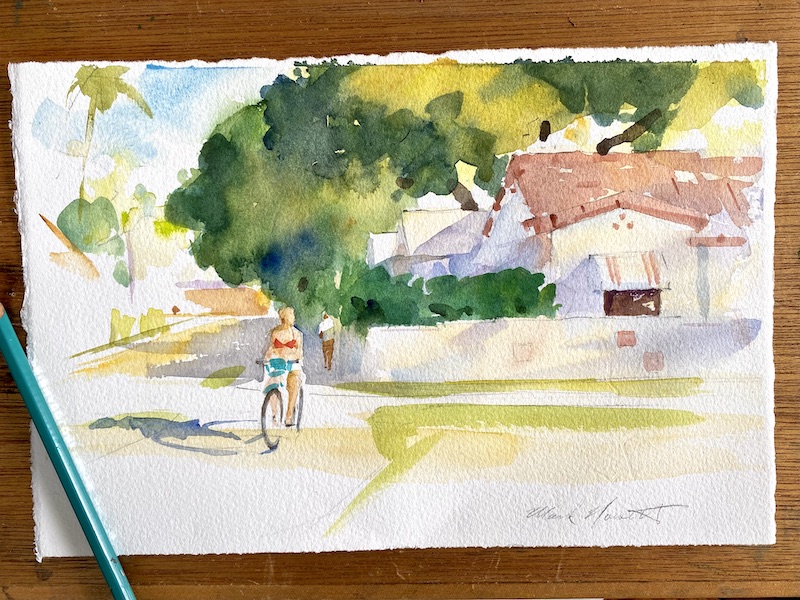
As for my effort, I envisioned a days-end feeling: the fading daylight, with rose colored cloudbanks overhanging the rooftops and random jumble of our neighborhood. And all to be painted in thoughtful, descriptive brushstrokes.

The initial setup and progress in the lay-in.

A Strategy

I decided it would be best to arrive at the spot around 5:45 each evening.  This would allow a window of workable light of perhaps 45 minutes.  I supposed I’d need perhaps 8 or more sessions, but it was hard to tell.

Practicalities

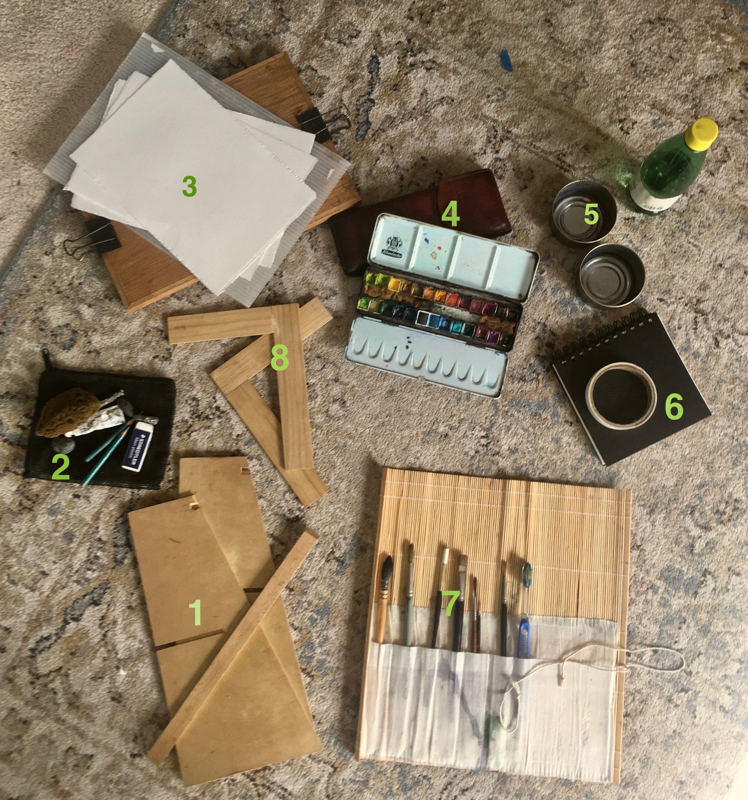
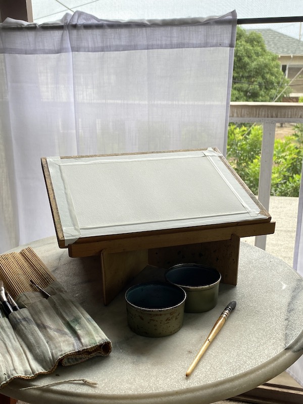
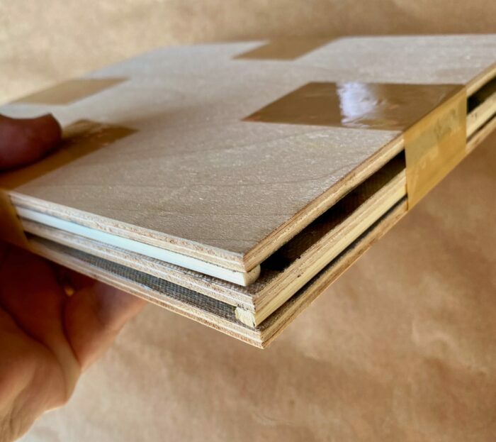
I keep “prepared” wooden painting panels in my studio, and decided 9 x 12″ was the right size. I also chose to use a tripod mounted pochade box. This would keep things compact… important because my own shadow was needed to block the sunlight behind me from falling on the painting, which would distort the light/shadow effect. Gusts of strong wind made using an umbrella to shield the painting from the setting sun too risky.

The Start

The first round of work involved getting the “main pieces” in the right spots on my panel.
I never rush this step because the personality of the whole painting begins in how the painting’s space is”divided”.  
I thought of the “main pieces” as the areas of land, sea, clouds and sky. . . 4 large, interlocking puzzle pieces. Which of those areas were to “dominate” is what determined the cropping. 
 
The large tower’s placement in the lower left quadrant was important. It’s a strong “point of attraction”…but needed to be placed with care.  The distant peninsula needed that slight “opening” on its far right edge. It connects sky and ocean as a single shape.
 
After the first sessions work. The paint was scraped down with a palette knife to “lose” hard edges and unify the work overall.

Next Steps

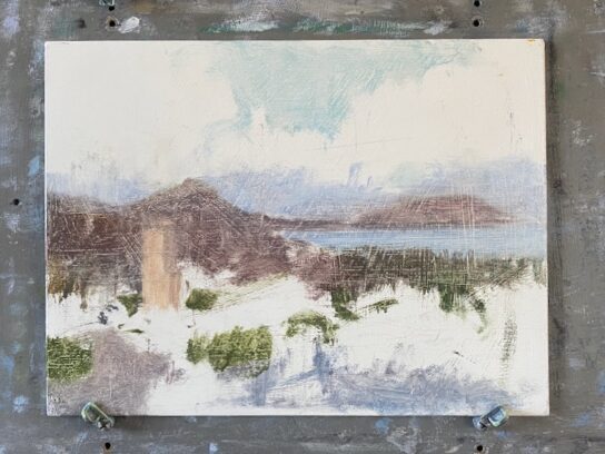
Weather permitting, I continued to return each evening for more work on the painting. Progress was gradual, but steady, always keeping the original intentions I described in mind.

In time I found that I was able to anticipate what the light and color were likely to do, which was a big help. This is just a sidebar here, but becoming familiar with the “personality” of a given location is a really wonderful secondary aspect of the “plein-air “painting process.  One’s painting locations can also, in time, become places of deep reflection and attachment.  

The painting on my studio easel, a few more sessions in, undergoing some morning-after adjustments. 

As the work progressed further, I also committed to trying to maintain some ideals…

  • To attempt to paint the “ensemble effect” …the overall appearance of the entire scene as it might appear in one glance.
  • Seeing everything as “simply a piece of paint”  of a particular shape, value, and color.
  • To pursue “suggestion” over “explanation”.  


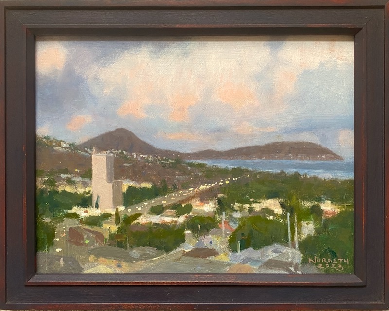
Completion Of The Work

The completed painting

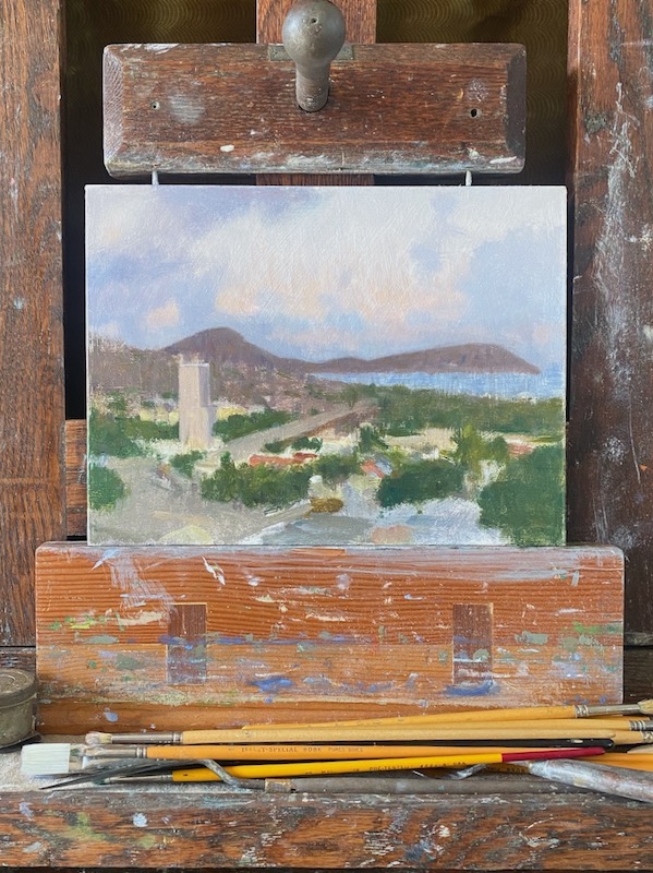
 Further sessions were simply about adjusting and refining, always with an eye towards the look of the entire painting, not fussing over specific and irrelevant details.

There was a nice general interest from the public. Most were unfamiliar with the kind of work I was doing.  It was pleasant to offer some explanations to the curious. That was a nice sidebar to the whole project.  

Because the painting is in traditional oils, the actual drying time is a minimum of six months. At that date, the owner of the painting will return it briefly for a final varnish. This will the crowning moment. . .the painting will then be restored to its original richness of color and permanently protected.

It’s just practice…the Farmer’s Market paintings

A watercolor painting created as a study in composition, color, and activity.

I practice often.

Saturday Market, Kapiolani #3

By this, I mean that to improve, I need to work on my skills. It doesn’t matter what the thing is…many aspects of being an artist require that skills get “under your skin”…become subconscious and natural. 

Have you ever thought of art as a discipline?  It’s wise to give it a try.

Following Good Examples

From a young age I made progress when making an effort to emulate something that had moved me. In my ongoing search (and I sincerely hope you’ll have your own), I’d find heroes… and then ask myself what do they have that I don’t?

In time I saw that I want my drawing to be fluent…with color both representative and inspired. And I need a design that makes the most of everything that the subject offers. These are examples of the sort of things we all need to identify about our own taste. And each of us will need to discover what moves us inwardly enough to take the risk of hard pursuit.

Arthur Melville (1855-1904) Scottish artist

My hungry eye has led me to discover artist’s I never would have dreamed existed. This beautiful watercolor by Arthur Melville contains much of what I respond to.  It’s an example of casual appearance which disguises his powerful ability to compose, draw, and then execute something that, we might guess, was only a brief impression on the artists’ mind. I’m grateful to have discovered his work, because he possesses the vitality and skill that I desire to obtain. From this example, and the work of many others, I get insights…. and then look for ways to practice what I’ve learned.

 I look at using exemplars, like Arthur Melville, as hints to what I could do using my own living environment. In his painting above, I see a well drawn solitary figure, surrounded with plenty of suggested activity. There are subtle echoes of shape and color, and an excellent dark/light pattern.

Where can I find something that would have those elements now, in our world?

Putting Inspiration to Work

During the period of the COVID restrictions, I decided to visit our local green market on Saturdays. This was one of the few places where people could gather communally (albeit very supervised) and go about the business of life. I would take my traveling watercolor kit over with 1/8th sheets (7.5″x 10″) watercolor paper and then search to find a shady spot to paint from. This meant being wedged into areas between parked commercial vehicles, behind the scenes. Privacy was never guaranteed, but I’m used to onlookers and questions.  From these cramped little shade-puddles I tried to compose and paint.

It’s Just Practice

I viewed these works as practice opportunities.  Arranging elements, capturing fleeting effects, and convincingly drawn figures who were often there for moments at a time. It’s juggling and there’s never a dull moment.

Even as I write this now, I’m reminded of John Sargent’s quip that watercolor is “making the most of an emergency”.

Each painting is 7.5″ x 10″, and usually represents a single visit of a couple hours duration. I hope this energizes you to have a look at your personal world and see what’s possible.


A Chance Encounter

A brief encounter on a bus sparked a portrait of a stranger, drawn from memory

I was recently on a visit to Portland, Oregon, which is my hometown. I’d planned to hit the local art museum, where I’d also attended art school decades earlier. As things worked out, taking the bus for my Sunday morning visit was easiest, and an idea that I looked forward to.

Being an experienced public transit guy, I’ve benefitted from the variety of experiences I’ve had on subways, trains and buses.  This includes uncounted hours of sketching in public transit…which ties in with my Rembrandt interest. So many of his drawings emanated from his solo experiences walking and simply observing the everyday life which surrounded him.

So, the story is that I climbed aboard a city bound bus, sparsely occupied. I had a small handful of fellow passengers and a driver who was all business, but approachable.  I checked with him about my destination, he confirmed I was in the right place. Finding a seat facing the front of the bus, I was  immediately next to the seating reserved for the elderly and handicapped that face the aisle. Because I’m feeling a bit outgoing this morning, I eventually start a chat with a fellow about my age across the aisle. It’s just pleasant small talk, but l feel at home back in Portland again.

As our trip to the city center continues, we stop and I sense a bit of change in the mood as a hard-luck sort of fellow comes aboard. Wrapped in what looks like a discarded cargo blanket, and with only the bare essentials of decrepit shoes and shorts otherwise, the small, haggard fellow takes the seat directly in from of me.  

Because it’s Portland, it’s become a normal sight, and this man seems utterly beyond concern with anyone’s reaction.  All the same I could feel our fellow passengers tighten up a bit.

Since I’d already broken the ice with my other neighbor, and knowing that I only have another fifteen minutes ride ahead, I decide to ask the man in the blanket how things are going today.  Glancing my way, he remarks that he’d been better, but I think he appreciated being addressed politely. Positioned as we were, I studied the fellow a bit, who was sitting in perfect profile.  I noticed a recent patient wristband which probably accompanied the sutures on his forehead.  

Somehow, momentary mutual trust was established, and so I mentioned that I was a visitor to Portland, but also a native. He was a native as well, and I ventured to ask if he’d attended high school in Portland.  Grant High School, he responded. I then mentioned that I’d gone to Jackson High, and asked which years he’d attended Grant. He was class of ’75, I was class of ’74. He then  mentioned having wrestled against Jackson. I asked how he’d done, and he said he’d won…and had gone on to place well in the state championships. He smiled a bit and seemed happy at the momentary recollection. But just as quickly he returned to his present reality.

Coming near the end of the my ride, I managed to locate the only cash I had, a single dollar bill. I folded it my hand, but as it turned out he signaled to get off the bus first. Before he rose to leave, I managed to explain that as a graduate of Jackson High School, I probably had known someone he’d wrestled against.  Therefore, in consideration of the ass-whooping he’d delivered, some royalty payments were likely overdue. I apologized for the meager offering, but he accepted it. Within a moment of having left the bus, I caught a glimpse of him putting the money to immediate use with a drug dealer who’d set up on the sidewalk.

I now suppose this fellow, if he didn’t get massive help, was a dead man walking.  Perhaps I brought a little joy into his bus ride, or contributed to his decline. But by the time I’d gotten to my destination a few minutes later, I’d decided I could at least attempt a drawing, a souvenir of a chance encounter, since I’d been studying him closely.

My first shot at capturing my recollection

I found a table and a cup of coffee on a sidewalk near the art museum, and set to work.  General to specific, overhead lighting. I drew a skull in pencil, and added features as I worked. He reminded me of some of my Scandinavian relatives, naturally small and slender, with similar construction in the features.  I put that familiarity to use.

The final image evolved over time. I’d pull out the drawing days later and shift something, or darken or lighten.

One interesting aside was that while I was working at the table above, a really charged-up (drugs) fellow came by and wanted to see what I was drawing. I showed him and he complimented the drawing.  And as he did, I looked at his eyes, which had been giving me problems in my drawing. And I saw the same look in his eyes that my drawing lacked. It’s something I recognized from the photos of holocaust survivors or POW’s I’d seen.  A stare, but a hollow one, if that makes any sense.  

Lorem ipsum dolor sit amet, consectetur adipiscing elit. Ut elit tellus, luctus nec ullamcorper mattis, pulvinar dapibus leo.

Where does your eye go?

So…where does your eye go?

That’s a question I’ve loved asking people as we view artwork together.

I love it because it begins to open us up to the idea that there may be a deeper experience awaiting when looking at a painting. That without any awareness on our part, a piece we’re viewing may be subtly guiding our eye intentionally.

An interesting side of composition involves the deliberate leading of the viewer’s eye. It’s not something I was every really “taught”, but since realizing that it exists, it’s added a lot to my enjoyment of good paintings and drawings. 

 I think it’ll do the same for you. But the first step is to study what attracts our attention and what gets it to move in a picture.

A Power of Attraction

Our eye is always searching…in a sense, it’s hungry.  We can notice how it works when leafing through the pages of a book, searches a room for misplaced keys, or recognizes a familiar person in a crowded public space. Our attention is drawn and engaged before we know it. For our purposes now,  we’ll simply call a this a “power of attraction”.

For paintings a “power of attraction” is anything within a picture’s composition that can attract your eye. We already know that a bright color in a drab setting or a human figure in a landscape can become a center of attention…what a lot of people call a “focal point”.But let’s consider what else an artist might use to move your attention in a more subtle way. Just for starters it could be any of the following…

-an open window or doorway in a background

-a contrast of light or dark, such as a highlight on a dark shape

-a color, by it’s strength or by contrast

-a contrast of objects…something that differs from others within it’s setting

-a figure or animal

-a sharp edge surrounded by softer edges

-any point/mark that has “power” due to it’s placement, especially nearer to an edge of the painting

Whatever it might be, it will possess a visual magnetism that makes itself known to you subconsciously. And importantly, not all objects have equal power of attraction.

As I gradually became used to this, it became very interesting to look at a picture merely only to see how the artist would draw my attention from one point to another. One specific moment  I learned a strange truth…that the central and dominant THING in a painting was not the main subject but an essentially abstract shape placed in the full light, with the artist in the self-portrait playing a slightly secondary role.  I found that reasoning to be fascinating.

And the artist?

Rembrandt Van Rijn

Why Study Rembrandt?

Though there are countless examples in traditional art we can study, I found that Rembrandt, and especially his drawings, are the ideal place to begin seeing this business in action.  Often his seemingly modest & commonplace themes become excellent lessons in leading the eye.

As an introduction to the concept for us to try together, this pen drawing is a fine example. I recommend that you enjoy a few moments with it before proceeding. Just pause and ask yourself where your eye wants to go as you examine it.

Rembrandt’s pen and ink drawings have a variety of “attraction” points that reveal themselves with a bit of looking.  The drawings were often created on ramblings in his town and surrounding countryside. This was not an extraordinary sight in Rembrandt’s day, perhaps the same as an everyday home would appear in our own neighborhood. These drawings represent his everyday experience, just as we also have our own familiar features of our time.  He was an eager observer, and exercised his gifts of observation and interpretation continually.

In this example, you may have noticed that your eye moved from part to part, resting here and there, and connecting one spot in the drawing to another.

A focal point isn’t enough

Having a point of interest that dominates the picture (a focal point) isn’t really the same as creating a series of connections that can lead a viewer through a picture. The reason is because a single focal point’s value is mostly only interesting as an object. The alternative we see with the Rembrandt drawing, a designed picture suggesting a discernible pathway, is a series of small discoveries that gives our mind an incentive to engage. Ideally, one is led to travel through the picture rather than looking at the picture.

Below is a breakdown of what I get from my own study of this beautiful drawing. I’ve found that the various things that attract my eye have differing strengths, but that with one thought a pattern can arise. But that’s just my interpretation. Where does YOUR eye lead you?

While I admit my diagram is subjective, I hope you agree that this is a dimension of picture enjoyment that, for an artist, is a valuable way to unify a composition.  Rembrandt’s drawn works (for me) are a particularly enjoyable source for seeing this in action.  If you’d like to dig deeper, I suggest looking at the library for books on Rembrandt’s drawings, or finding the old Dover publications of “Drawings of Rembrandt” (volume II is my favorite) as a starter.

If you want to really get a handle on composition, it’s a fascinating dimension.

My Wandering Watercolor Kit

The desire to create a very portable, yet complete watercolor kit has been a real side-passion.  Happily, I’ve finally arrived at something that solves both the weight/bulkiness issue,  but not by limiting key materials that I feel are necessary to solve most of my watercolor challenges.

I like it so much that Id like to share it with you!

The mission

I love the little watercolor sketches, done as studies generally, that come out of the European tradition. My favorite quality is what I’ll describe as a grasp of the whole in a beautiful shorthand. There’s enough to them to transmit the idea, vision, a mood, but it’s done in exquisitely brief terms. Artists such as Streeton, Zbukvic, Fortuny (at times), Seago, and Fowkes (sorry, it sounds like a law firm, but look them up) are great examples of painters who have impressive small works done in that beautifully simple fashion.

I’ve wanted my own sketches to have that, and so in the last 2 years I’ve taken some time to wander about, sketching in watercolor with the particular goal of creating simple, small (but composed) looks at my everyday surroundings. Sometimes, these are springboards to later and deeper works, or serve towards trying out a neighborhood location and seeing how things go.  But certainly, a big part of that mission  included choosing the physical tools that will serve me without overloading.  Some boundaries would be needed.

The parameters

These are the qualifiers I settled on…

The right pigment colors, in a suitable box, with a small but  sufficient number of good quality brushes to accomplish my objectives. A wash, a flat, a pointed round or two, and a rigger should be enough, plus a safe storage that allowed for evaporation of any small amount of moisture left on the brushes.

A drawing board and paper storage for several 1/8 sheet (7.5 x 10″) sheets of watercolor paper.

An easel that is small enough and versatile enough to set up in unusual situations. On a bench, stair step, cafe chair, etc.

Small water container

Small drawing kit

and everything fitting into a small backpack.


The solution


Here’s what I’ve finally chosen and have been using…

1. A small wooden easel, from an old design discovered by a student of mine in a book written by John Pike. The original was cardboard and meant to be makeshift.

2. My drawing essentials…two sharpened pencils (4B or 6B, two, so there’s an immediate backup) pencil extender, small boxcutter for sharpening (not pictured).   2 erasers…a soft, kneaded and a firm plastic eraser, small sponge, a piece of white candle wax, opaque white pigment tube. The bag is zippered and plasticized mesh, so dirt/sand/grit doesn’t collect, a great feature.

3. Watercolor paper, torn to size.  I use 1/8th sheet (7.5″ x 11″)  Saunders or Arches 140# cold press paper. A sturdy wooden drawing board, and a piece of Coroplast cut to the size of the drawing board.  Two binder clips to hold the package together, with the paper sandwiched between.

4. Watercolor box with half-pan pigments.  A mix of some Schmincke, some Holbein, and Winsor & Newton. Necessary colors for me include Ultramarine Blue, Cobalt Blue, Cerulean Blue, Viridian, Hookers Green, Cadmium Lemon, Cadmium Yellow, Naples Yellow, Yellow Ochre, Raw Sienna,  Cadmium Scarlet, Cadmium Orange, Light Red, Indian Red, Burnt Sienna, Permanent Alizarin Crimson (I’m considering a replacement currently), Permanent Rose, Raw Umber, and Ivory Black. Permanent white (tubed)

5) Small cans, one for clean and another for not-so-clean wash water. A plastic bottle for water.

6) Small sketchbook, spiral bound. Spiral is important because I want to be able to open the cover fully, and I have a clip to hold the paper in place in windy conditions. I always do a thumbnail drawing for every piece before beginning the painting… I think it’s a great means for selecting what you’re actually after before getting lost in painting decisions.

A roll of white artist’s tape.

7) Brushes:  a small squirrel mop, a well-used old #7 sable round, a sable flat, a small sable round (for a crisp touch when needed), and a rigger for very fine lines. The tooth brush is mainly for cleaning the palette after the session.

8) Square Corners….this is an adjustable-window viewfinder, I find it very helpful during the sketchbook and composing stage. Referring back to the artists I mentioned admiring, that quality of fresh simplicity is from choices they make to eliminate the clutter and get to the bones of the composition and effect. Doing this visualization in advance, with square corners and my small sketch, helps me tremendously.  Made of wood is ideal (for durability)… but cardboard works, too.


Setup


This little stand can be assembled in a moment, and holds the drawing board with paper at an angle that I prefer for washes and general work. It can sit on any level surface, and I’ve used it on staircases, cafe tables, folding stools, and chairs. Because it’s very compact when disassembled, I like having it along.


A table-top setup, for use when standing


Where can this take us?

Speaking personally, some of my happiest hours as an artist have been while I’m out in the world, working in the midst of actual life, surrounded by actual people. I’m convinced that the work I do in those precious hours has a positive effect on my studio work.

A grasp at the rapidly-changing essentials

My Favorite Way to Study Composition


We know that with practice, most artists will get a handle on “how” to paint the parts of a picture. But the composing of pictures is a different task…one that requires experimentation, sensibility, and the development of taste. And the question is…where do we find those tools? 

It’s good question.  Here’s where that question has led me.

There’s a Power of Pattern

In my own long search to learn how to compose (meaning “organize a painting well”), I saw that I’m drawn to certain pictures by some vague attraction that I can’t account for. An example was that while flipping through the images in art books, something was making me stop and go back to something that flashed by my eyes in a moment, even though I’d only had the briefest of glances. Over time I was able to figure out that  an overall pattern of a painting was the subconscious power at work. 

Realizing this, I was able to eventually work out a simple method of analyzing the paintings I most loved, and then adapting what I’d found into my own pictures. The method is useful in studying the work of others, or designing one’s own compositions. I simply call it the 4 value study.

The 4 Value Study

This process takes the artist through the placement of the largest shapes first. This is the division of the canvas, so to speak, and these are the big initial decisions that eventually affect everything to follow. If you’re doing a study from a painting in a book or one in a museum, you will gain insights into how that artist has chosen. If you’re out in the field on a landscape o working with an interior subject, you’ll be planning in advance how the pattern might work, and preparing for less struggle in the long run.  It’s often been observed that the regrettable decisions that are evident in a finished painting are choices made in the very first stages. This reduces that danger. 

Also among the benefits are

  •  it can be done in a short amount of time, (in this example, about 25 minutes) with simple materials, and in your personal sketchbook. This enables you to easily review.  
  • The exercise has you retrace the original artist’s steps, because you start with the “big pieces” that make up the underlying structure. This puts you “looking over their shoulder” in the decision process, because they probably put their energy into the interrelationship of the main pieces. 
  • With only 4 values to work with, you must ignore details and and instead see the painting in terms of a pattern…that is an intentional arrangement of big values and big shapes.  That’s part of what’s catching your eye to stop and look in the first place. 

 Where do I start? 

Begin with a good painting from a good source.  

Find a painting that you admire… a painting that you wish you had made. I sometimes look online, on sites such as Pinterest, and have particular artists I find especially beneficial. Their small studies are often in the same mix with their completed works and are great helps.  Also, books and catalogs from museums, available free at the library, are a good place to poke around for images that impress you. But best of all is before an actual painting in a museum, which is a wonderful way to the most out of a visit.  And nobody will mind your sketching in a small sketchbook. Other people will be interested/inspired to see you working.

If you choose a photograph, choose a photo in color rather than black and white.  The advantage of color is that you’ll learn to read the value of color, which takes some practice, rather than having it done for you by a black and white reproduction.

The only tools I use are a soft graphite pencil (6B is good), and an eraser at the end for cleaning things up.  And as I’ve mentioned, I like to mingle the 4 value studies in my regular sketchbook that I do my other work in.

Procedure

For the demonstration, I’m using my sketchbook and an image from a book. The painting is by a favorite Russian impressionist, Isaac Levitan. I picked it for its full value range (meaning from white to almost black and simple grays) plus interesting big shapes. He’s a favorite artist of mine, so why not get inside his head?  What easier way to learn about his work? 

                                    The first sep in a four value drawing 

                                      The art and the sketchbook positioned for easiest comparison. 

In the image above, my sketchbook and soft graphite pencil are at hand, and the painting I’m working from is immediately in front of me at a comfortable angle. This is so my eye travels the shortest possible distance to compare the image and the drawing.

Part 1. How to start

A.  Find the proportion of the rectangle that I’m copying. It needs to be the same proportion (size) as the rectangle in the reproduction. If you need to use a ruler, feel free. Notice the faint “crosshair” lines to show the center of the rectangle…and it’s okay of they are loose and sketchy at the start. This division of the rectangle will help p you tell where the shapes in the painting are. 

B.  Make a scale of 4 steps below the rectangle.  Start by drawing a small white box, two more empty boxes, and then a very dark box, like I’ve done at the base of the drawing above. This is the outside range of our pencil’s ability to create light and dark.  Between the black white box and the black box, create a light grey and a darker grey. Try to keep the steps between all four values even. 

Important-everything within your drawing is going to be in one of these four values, even though you’ll see many more values in the painting. Your challenge here is to simplify the many values of the painting into four. 

C.  Start with a large shape first.  The dark water forms a big shape, and the sky another, so I’d start with one of those. Try to place them as accurately as you can, and with a very light, sketchy touch. If you can do so very lightly, it’s a good advantage. Study the original and compare the big shapes to what you’re making, and adjust if you see something that looks off. 

Once that’s established (again, with a light touch so you don’t have to scrub out dark lines when adjusting later), continue to outline the shapes of the painting. Sky shape, trees shape, snow shape, etc.  

Some advice that will be very helpful..work from the largest first, lightly, then work your way down to smaller shapes. Disregard as many details as you can, they’re just clutter at this point.  Add them after the big shapes and values are right. 

Part 2. Getting the Light & Dark

Now it’s time to render the values.

To begin this step, take the lightest of our two grays and cover the entire paper with it…except what is to be white. This is what I’ve done in the image below. You can see what I did in the photo, and using light 45° strokes is the easiest and most natural way to lay down a gray.  We’re “reserving the white”, much as a watercolor painter does… but everything else will at least be the second grey. So you can cover everything but the lightest shape with it.      

Our lightest gray applied.


Third Step

The addition of the first grey sets us up for the next, our darkest grey, which is 75% darker gray from the white to black.  Since we’ve already applied our light grey over everything that’s not in the white value makes this step easier. Anything that’s not in the darkest dark or the lightest grey will be made of this, regardless of what type of object it happens to be. And remember, it’s only shapes we’re interested in, not any details. 

One thing you’ll probably realize is that all of this requires you to make decisions about how to group things simply.  Four values aren’t nearly enough to account for everything we see in a painting, but that’s the good part…we now have to forget about what things “are” in the painting and work as a designer…grouping values together regardless of what they represent (sky, water, hills, etc.) in the picture.  

The reason you want this skill is because it will lead to freshness and clarity in your own work.  And you can develop the skill in your sketchbook…it’ll change how you view painting for the better. 

Final Step


To finish, it’s simply a matter of adding the pattern of the darkest darks to the other three. This is where it’s advantageous to have used a soft pencil; it makes that darker value easier to apply richly.

After doing so, I finally clean up the whites a bit with my eraser, re-adjust the values a bit overall, and enjoy the drawing and painting. A light application of a spray fixative will preserve it for years to come. 

Conclusion

One of the main task of the painter is to arrange and organize what you paint. Determine what’s important, and discard everything that isn’t. With this method and some practice, you can learn the thinking artist’s you admire put into their own paintings, which is information that you won’t get by just looking and admiring. 

And finally, the greatest benefit comes when you are in the field working out a painting, or in a studio with a painting, this skill will certainly help you quickly determine your best design. 

I hope you’ll give this a try…and would love to hear about your experience or any questions. Feel free to comment, and GOOD LUCK!

Lorem ipsum dolor sit amet, consectetur adipiscing elit. Ut elit tellus, luctus nec ullamcorper mattis, pulvinar dapibus leo.

The Tune-up

Each developing artist has the opportunity of determining the type of artist they wish to become.

For some of us, this direction may be the response to obvious inborn tendencies. In this case the direction seems rather clear, and it becomes a matter of obtaining skills and experience, which marks the beginning of the journey. For others, the choice can take a different course; one of feeling your way along, stopping completely at times… and trying different doors, developing a gradual view of where to aim. And combinations of the two are often possible. 

In either instance, for any prospective artist, the skills necessary to achieve a level of proficiency require time and sufficient interest on the part of the person to develop. 

The necessary ingredient for any art enthusiast’s growth is that they must be a self-starter.  And in service to this truth, it’s the development and maintenance of skills that I’m writing about today. 

On occasion, perhaps a few times a year…I find myself needing to retreat from the usual routine and just concentrate on my general basic skills. And one of the most effective ways that I know is to do either a drawing or a painting from a plaster cast.

The Cast

Plaster casts have been around for centuries, and acknowledged as an excellent tool for developing visual perception in an artist. This is for good reason…

Among these qualities:

Casts are stationary models.

The cast is white, which means it’s halftones and shadows are clear shades of grey, and so within the reach of charcoal (if drawing) or paint.

Casts are often styled after fragments or entire sculptures from classical sources, and so possess intrinsic refinements.

On my little journey with the cast below, I set out to do a brief (a matter of about 6 hours) but fairly thorough oil study under daylight conditions. This is enough to serve as a checkup on my “eye” for shapes, distances, values.

As seen in the photo, I set the cast up so that it was directly next to the primed panel I was to paint on. I then chose a viewing position (about seven feet back from the arrangement), where I was to spend about half my time looking and deciding from. This is important; you must be viewing from exactly the same point, at a distance, and making your decisions there, approaching the actual painting only to paint what you’ve decided to from the viewing position.

After the strokes are placed, I step back and assess. This procedure is continued for the duration of the exercise (the strategy described is referred to as the sight-size method).

As each additional bit of the painting moves forward, it’s important to compare carefully from the viewing position. Height, width, shape, and value are all improving gradually and in a unified manner, with no single aspect getting further along than another. 

This procedure goes from the largest to the smallest, the outside (biggest shape) to the inside (smaller shapes), and from the general to the specific. This is itself a remarkably helpful habit to acquire for a representational artist. 

Over a few hours the painting begins to resemble the cast more and more. Because I prefer daylight for illumination, the shadows move very slightly but constantly, so I must eventually select a time of day to limit the work, which I can return to a following day at the same time. 


The artwork and cast are set up closely to help with easy comparison.

The Reason

The entire point of all this is to tune-up my ability to see shapes (the cast, the shapes of shadows upon the cast, etc) accurately. This includes being able to read the values (degrees of lightness and darkness) of the shadows and the half-tones truthfully.

The wonderful thing about the procedure is it will teach us to work from general to specific.  This is a very good habit to formulate and will serve you well in everything you do. The image above shows the first hour or so of work… essentials are laid- in very generally, yet still with relative precision at each touch of the brush. 

As I worked, I gradually adjusted things more closely to the actual cast, but moving around the object to where it was farthest from “truth” (the actual appearance of the cast) rather than “finishing” bit by bit. It’s important to keep the entire painting moving forward in the general-to-specific mode, much like slowly adjusting the focus of a lens.

As I proceeded, remembering to step back to my observation point regularly, I found that I tended to make my shapes a little too wide, and so became mindful of that. As the light on the cast gradually changed, the shadows correspondingly moved and changed value, so I also had to stay on top of that as well.

Gradually the cast came together over two mornings of a couple hours work each. I chose not to push it any further though there were things that could have be better…. with me, there’s a tipping point where the painting can turn to an over-finicky attitude that interferes with the general purpose of the exercise.

The Benefit

Confidence…I can look at something in nature (meaning anything visible to my eye) and I’m able to trust my eye to assess the height, breadth, value and shape accurately. I could liken this quality to clear diction in a speaker, being “in tune” to a musician, the ability to assess actual flavor to a winemaker. 

Fluency…this increases efficiency; I can grasp the actual shape of a mountain or a portrait sitter’s head faster and with less struggle than ever before. I can catch distortions much earlier, rather than when the work is too far along. This creates a real freedom to explore color and other expressive qualities because I trust the general foundation of what I’m painting is in place.


The cast-study at completion time. 9″x 9″ oil on oil-primed masonite panel.

So, in conclusion, I highly recommend this exercise as a skill building instrument. It’s for anyone painting anything where representation matters, not excluding landscape, seascape, genre, figure, or any other  form of painting. I’ve benefitted countless times from the imbedding of the good habits that come with this sort of work…and frankly, I enjoy the work very much. 


Traveling With Wet Oil Paintings

When traveling, no other activity in painting brings me more excitement than taking my old pochade box outdoors in search of a new motif to tackle.

Being a Hawai’i resident, trips to the mainland are welcome opportunities.  I can paint in situations where the visual content is rich in different ways than at home. The architecture, color, climate, citizenry…all offer a fresh point-of-view.  I love carefully scouting out a spot where I can unobtrusively compose and paint a sketch.

But when working in oil, there’s also a serious practical matter involved. How can we get damp paintings home safely with minimal expense and fussing?

Here’s what I came up with.

Divide and Conquer

For this to work, the oil sketches need to be the same dimension. Fortunately, I only brought the size panels that fit my box, so all are 8 x 10″.

In this image, the paintings are numbered from earliest (1) to latest (3).  When it came time to pack, painting 1 was sufficiently set-up

My three fresh paintings, in order of dryness to the touch.

as far as being dry to the touch. It was the least vulnerable to damage. 2 was still soft, but was fairly set-up as far as dryness to the touch, being about 4 days along in drying. Painting 3 was the wet one, and so became the big concern among the paintings as I packed them.

Just a note…I don’t use driers (or any other means) to accelerate the normal drying time of oil paintings.  Exposure to air circulation and normal daylight conditions are ideal.   That discussion is for another time, but I wanted to mention it here.

Enter the Bamboo Chopstick

Being that I live (and eat) in Hawai’i, I’m used to disposable bamboo chopsticks as a part of routine life. When I needed to find a short, thin, readily available spacer to separate the paintings, I needed not look further. The ones we found are rectangular at the grip, ideal for use as spacers. Easy to cut if needed, they rest positioned on the painting’s edge, where the rabbet of the frame would overlap. That means any area of damp paint the chopstick might disturb would be easy to touch-up, and likely invisible once the paintings are framed.

The driest painting, upper left, with two bamboo chopsticks in place.

Using painting 1 as the base, I added a pair of chopsticks cut to the height of the painting, and placed them both along the edges on two sides. 

The second driest painting, top, resting over the first painting, separated. Two more sticks are in place, this time on the horizontal edges.

Next, I seated painting 2 on the platform thus created, and also facing paint-side up. There’s about 1/4″ between the paintings, which is great.

For painting 3,  wettest of the oil paintings, I faced it downwards. I was careful to seat it where the chopstick dividers would rest against the painting’s edges. Once positioned, I used some packing tape to bind the whole “sandwich” firmly together, as seen below.


The third and final painting, the wettest, is placed wet-side inwards. on top of the prior painting. The entire “sandwich” is then snugly and carefully taped into place with packing tape.

When this was done, it was only a matter of wrapping the combined paintings in some sturdy brown wrapping paper, and taping them closed.

Since I decided to carry them in my suitcase,  I took a moment to indicate the contents on the wrapping,  in the off-chance that my bags were opened for inspection.

Paintings wrapped and ready for my suitcase. On the off-chance that the bag is opened for inspection, I’ve marked the package descriptively.

I hope this is helpful to others. The whole process took about 20 minutes, and everything survived the flight perfectly.

Feel free to offer your comments or questions.