A Small Portrait Head in Oil from Life

Ala Prima oil

I’ve just had the pleasure of completing this small  (10 x 8″) oil portrait from a model that has been sitting for the portrait class that I lead Tuesday evenings a The Honolulu Museum of Art School.

Noil is a rare find, he has a great look and focus, and maintains a pose with great accuracy.  At one sitting, (perhaps more than one, now that I think of it), he stayed in pose for the entire three hour session without a break.  Our kinda model!

Noil


Anyway, I managed this small piece while teaching, and it’s grown on me over time. There’s a simple and direct “thing” it seems to possess.  “Noil” is painted on masonite primed with Gamblin oil primer.

A Fresh Portrait Drawing in Charcoal

From last evening’s Portrait class…I managed to turn out this fairly quick charcoal drawing of Noil, a very good model we’ve had the pleasure of working with.

Vine charcoal is about the simplest drawing media one could dream up, but really deserves a great deal of respect for it’s amazing qualities.  It has a value range from a whisper to a roar,  yet can be made to disappear with the sweep of a rag.

buscaglia

                      Noil B. Vine charcoal on Canson MeiTeintes,  about 11 x 14″

Pastel Portrait…a moment revisited

autumn pastel Autumn, pastel on paper , 18 x 24″

I received word that this painting, which has been in my flat files for perhaps six years now, is going to be purchased. Pulling it out and re-viewing it brought back a lot of memories.

A Moment Revisited

The subject, A. T., was in college in NYC as an art major but here in Hawai’i on a visit home.  Now, she’s happily married and with two children, something that certainly wasn’t on her immediate horizon then.  I was doing mostly the ocean pieces that many viewers are used to seeing, and wanted to exercise (or revive) the portrait side of myself.  So I engaged her for a few drawings and paintings during afternoons. I thought it was a good fit. We talked about life a lot while she was posing.  I was a Sunday School teacher at the time, and  my thoughts tended toward the philosophical and spiritual, which is still true I suppose.  Posing is tedious work and she did very well. Things change, people change, and life passes quickly.   I should do more of these. They don’t stop any of the change, certainly, but they contain it somehow and there’s a solid satisfaction in providing that for other people’s lives. Autumn cropped

12/11/13 A Portrait Sketch in Pastel

This is a two session pastel head that I managed to get completed last night in our final “Drawing and Painting the Portrait Head” class at the Honolulu Museum of Art School.  The first night was an hour or two of placement of shapes and color, the second session was just moving forward with the whole piece.

Tom, our subject, was new to sitting for portraits, and did a fine job.  I’ve found that a model must, perhaps above any other quality, possess some sort of inner life….an intellectual, spiritual dimension to their character that they can exist in during the long and tedious process of sitting.  People who require external stimulation to focus on simply won’t be able to do the work for long.

Tom Ciletti

This was the first pastel I’ve done in a while.  I used Lascaux pastel ground on a piece of rag mat board, which I then toned with gouache…just  stuff lying about my studio! The work was done with my Girault setup and some  Stabilo pastel pencils for the smaller passages on the features.  I wanted the informal sort of look that I got, nothing fussed over too much, except the drawing (i.e.placement of shapes) and color choices, which I pushed forward as best I could.


My Interview in the Honolulu Museum of Art Blog

I was recently invited to field some questions on art and my teaching philosophy by Clarke Reilly over at the Honolulu Museum of Art for their blog.

Clarke was able to drop by one of our Life Drawing sessions and take some photos, and we had a chance to get reacquainted. We’d first met when I was painting in the Palm Courtyard at the Museum, and she was kind enough to look me up again for this project.  As for the interview, Clarke’s questions were very good, the kind I’d hoped to be asked (!), and I really enjoyed putting together my responses.

You can have a look and read here:

Clarke Reilly/Honolulu Museum of Art Blog


Students in Mark Norseth's Life Drawing Studio class sketch a live model.

A Studio Solution to a Plein-air Problem


Responding to a surprising  improvement

While working outdoors on a watercolor, I ran into a situation…a scene before me greatly improved as I was working by the unexpected addition of a pair of figures that were not part of the original concept.

Since I’d already begun applying paint to the piece, these characters couldn’t simply be added into the composition.  But I knew their addition would  make such a vast improvement that I couldn’t just let the opportunity pass me by.  I decided to make a completely new painting, but I knew that there would be no time to do so directly and at the location.

So, my first step was to sketch these two figures hastily in my sketchbook. These guys, who happened by and were now sitting only yards away, weren’t likely to cheerfully respond to a request that they pose for me, so I dashed them off rather secretly…their silhouette and relative position to the horizon…so I could place them into a new composition and have them be the correct size. I then made some mental notes, watching how they interacted, their posture, gestures, and so forth.

kaimanu sketchbook                     
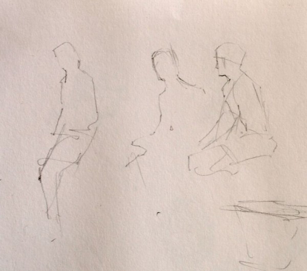
The sketchbook drawings

This accomplished, I was free to leave the location with a plan to start a new painting  in my studio the next day, relying on my incomplete painting, the new figures in the sketchbook, and hopefully some luck.

A Studio solution to a Plein Air problem

I have a background that includes having worked as an illustrator.  Illustrators are pragmatic artist/craftsmen and  accustomed to solving problems efficiently. They’ve developed a large playbook of applied techniques and one of the great tools of the trade is the use of tracing paper for refining and transferring drawings.

To shape the quick sketchbook notations into viable figures that would hold up in my painting, I would need to refine them from memory and a certain amount of invention. That’s where tracing paper came in….I created overlays of the rough drawings, gradually adding details from memory, refining and retracing until I had two figures of the correct size that expressed what I was after in the painting.  Because I did so on tracing paper, that stage of  work was all done without touching the delicate watercolor surface, which does not enjoy erasure and revision.

After a couple hours work, the elements of the entire composition were  combined on tracing paper and were ready to be transferred to the quarter sheet of watercolor paper for painting.

WC graphite

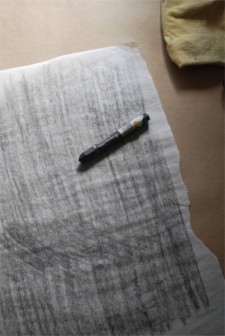
For this I used a simple graphite transfer sheet(above) that one can easily make themselves with graphite, a piece of tracing paper, and perhaps a bit of rubbing alcohol to liquify the graphite on the transfer sheet.  I placed  my graphite transfer sheet (graphite side down) between the securely positioned tracing paper drawing and the watercolor paper, and traced with a ballpoint pen over the original drawing.

kaimanu dwng 1a

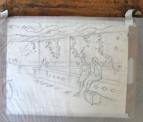
The tracing paper cartoon positioned over the watercolor sheet. The transfer has already been accomplished, and is visible beneath the tracing paper, which has been moved aside slightly to reveal the transfer.

The next step was to fold back the tracing paper and strengthen the graphite transfer with the usual pencil work.  One can flip the cartoon back into position if anything hasn’t transferred.

Kaimanu dwng 2

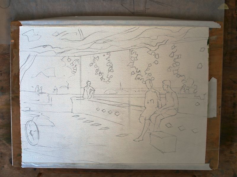
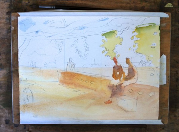
The transfer on watercolor paper, strengthened with my customary pencil work

At this point I have a pristine sheet of watercolor paper with the drawing positioned exactly as needed, with all of the figures worked out adequately, and without any erasure damage to the watercolor paper.

I then resumed my normal painting sequence, beginning with the figures because of their difficulty, and moving outward and around from there.  I’m referring to the prior painting from the location for color and some details.
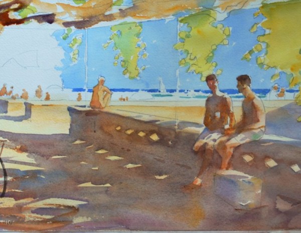
Kaimanu dwng 3


Kaimanu 4

And on it went!


“The Palm Courtyard”-getting closer to home

18 x 22″ oil on linen


I’m chipping away at the values and colors of this piece, getting closer to calling it finished. The sessions (about 6 so far) at the Honolulu Museum of Art have been a great pleasure for me, and I’m hopeful of wrapping up my work this week.

Along with clarifying the values,  I’m refining shapes somewhat, keeping lost edges lost,  and especially getting somewhere on the palm that is central to the composition.  Scraped down, repainted; it gets too picky in the details very easily, and I’ve had to take it all down on more than one occasion and redevelop it. The greens are so beautiful in life, I keep re-establishing them to get at some of the richness in the darker areas.  The foreground is only a bit more than layed-in, and doesn’t need too much more to my eye.

A thing suggested…a theme for the whole work maybe.

Whatever color the container in the right hand corner is, it’s beautiful to try and paint…a cool yellow in shadow, always tricky.

I hope to keep this painting light and open in feel, with the just the right amount of mystery… from value adjustments and color touches. It needs to look like paint, and I’m using the old three-part medium in this to get some richness and brushwork evident.


On my easel ~ “The Palm Courtyard”

“The beginner seeks to improve their paintings by adding details.
 The artist does so by refining relationships.”  
 -M.N.
The Palm Courtyard (working title) 18 x 22″ oil on linen

Thanks to the kind generosity of the Honolulu Museum of Art, I’ve been allowed to work on the Museum grounds in this very special location, the Palm Courtyard.

The courtyard  itself is one of several integrated into the Museum’s design, in this instance quite a large area with all sorts of compelling tonal, color, and light/shadow things happening. When I first entered it with an eye towards painting something, it was as if I’d stepped into a life-sized still life arrangement.

Composition ideas often come when I’m looking for “something else”, and this particular  arrangement caught my eye while setting up our model for my class “Painting the Model en Plein Air”.  Perhaps the biggest attraction was the momentary effect of light falling on the large palm  right-of-center (which at this stage of the painting is not yet developed) and the beautiful variety of shapes which I find lead the eye nicely.  Also, the full value range —  from bright, near dazzling light to near darkness…are a big challenge.

The painting is developing slowly…many trips to the location, and as a nice additional bonus, plenty of  interest from Museum visitors and staff alike.  A few have added a brush stroke of their own to the painting at my urging; I believe it’s good to let people experience the process and I enjoy doing so immensely.

As the painting progresses through increasingly subtle adjustments of color, shape, and value, I hope it will capture some of the very quiet richness of this easily overlooked courtyard.  As I stated at the outset, and teach my students,  the artist attempts to improve the work by adjusting relationships.