A Chance Encounter

A brief encounter on a bus sparked a portrait of a stranger, drawn from memory

I was recently on a visit to Portland, Oregon, which is my hometown. I’d planned to hit the local art museum, where I’d also attended art school decades earlier. As things worked out, taking the bus for my Sunday morning visit was easiest, and an idea that I looked forward to.

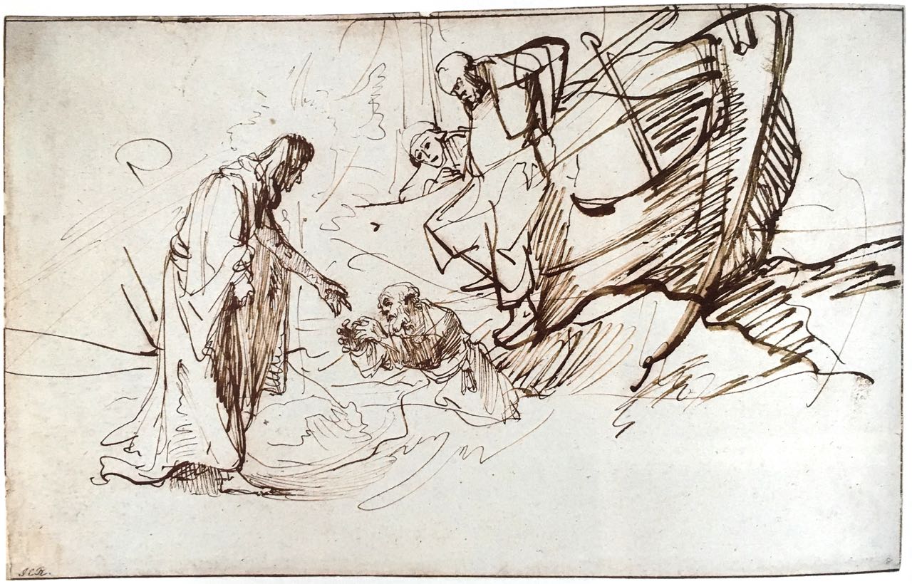
Being an experienced public transit guy, I’ve benefitted from the variety of experiences I’ve had on subways, trains and buses.  This includes uncounted hours of sketching in public transit…which ties in with my Rembrandt interest. So many of his drawings emanated from his solo experiences walking and simply observing the everyday life which surrounded him.

So, the story is that I climbed aboard a city bound bus, sparsely occupied. I had a small handful of fellow passengers and a driver who was all business, but approachable.  I checked with him about my destination, he confirmed I was in the right place. Finding a seat facing the front of the bus, I was  immediately next to the seating reserved for the elderly and handicapped that face the aisle. Because I’m feeling a bit outgoing this morning, I eventually start a chat with a fellow about my age across the aisle. It’s just pleasant small talk, but l feel at home back in Portland again.

As our trip to the city center continues, we stop and I sense a bit of change in the mood as a hard-luck sort of fellow comes aboard. Wrapped in what looks like a discarded cargo blanket, and with only the bare essentials of decrepit shoes and shorts otherwise, the small, haggard fellow takes the seat directly in from of me.  

Because it’s Portland, it’s become a normal sight, and this man seems utterly beyond concern with anyone’s reaction.  All the same I could feel our fellow passengers tighten up a bit.

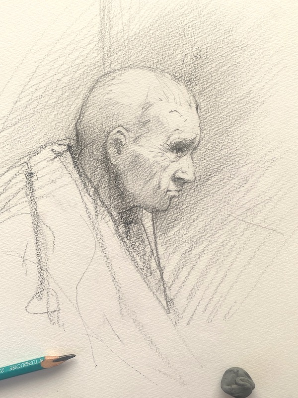
Since I’d already broken the ice with my other neighbor, and knowing that I only have another fifteen minutes ride ahead, I decide to ask the man in the blanket how things are going today.  Glancing my way, he remarks that he’d been better, but I think he appreciated being addressed politely. Positioned as we were, I studied the fellow a bit, who was sitting in perfect profile.  I noticed a recent patient wristband which probably accompanied the sutures on his forehead.  

Somehow, momentary mutual trust was established, and so I mentioned that I was a visitor to Portland, but also a native. He was a native as well, and I ventured to ask if he’d attended high school in Portland.  Grant High School, he responded. I then mentioned that I’d gone to Jackson High, and asked which years he’d attended Grant. He was class of ’75, I was class of ’74. He then  mentioned having wrestled against Jackson. I asked how he’d done, and he said he’d won…and had gone on to place well in the state championships. He smiled a bit and seemed happy at the momentary recollection. But just as quickly he returned to his present reality.

Coming near the end of the my ride, I managed to locate the only cash I had, a single dollar bill. I folded it my hand, but as it turned out he signaled to get off the bus first. Before he rose to leave, I managed to explain that as a graduate of Jackson High School, I probably had known someone he’d wrestled against.  Therefore, in consideration of the ass-whooping he’d delivered, some royalty payments were likely overdue. I apologized for the meager offering, but he accepted it. Within a moment of having left the bus, I caught a glimpse of him putting the money to immediate use with a drug dealer who’d set up on the sidewalk.

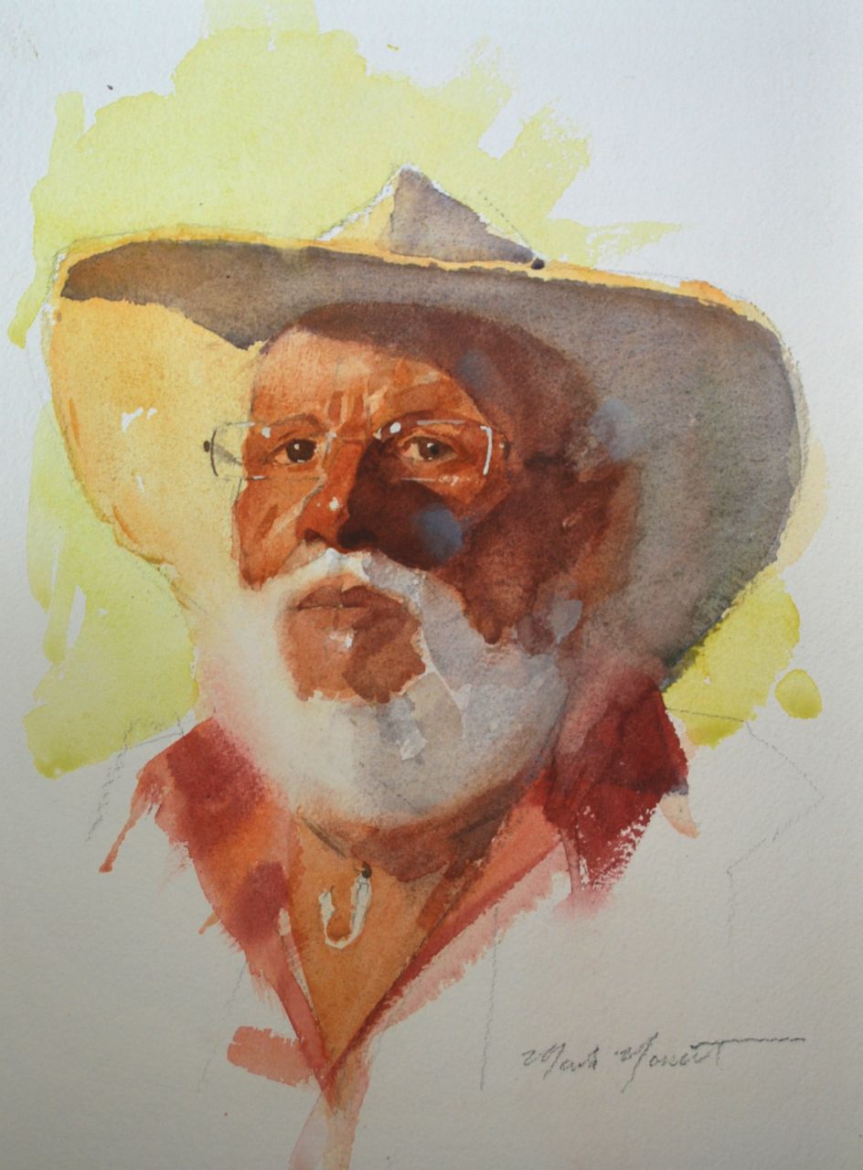
I now suppose this fellow, if he didn’t get massive help, was a dead man walking.  Perhaps I brought a little joy into his bus ride, or contributed to his decline. But by the time I’d gotten to my destination a few minutes later, I’d decided I could at least attempt a drawing, a souvenir of a chance encounter, since I’d been studying him closely.

My first shot at capturing my recollection

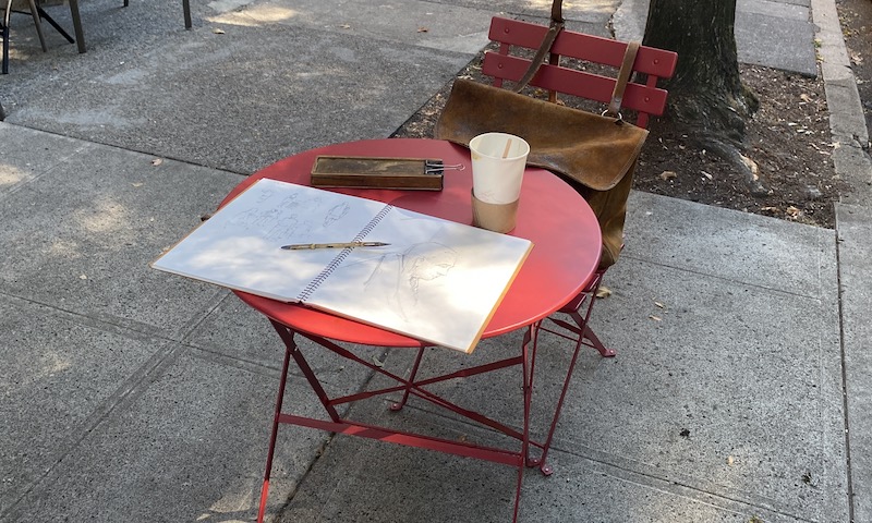
I found a table and a cup of coffee on a sidewalk near the art museum, and set to work.  General to specific, overhead lighting. I drew a skull in pencil, and added features as I worked. He reminded me of some of my Scandinavian relatives, naturally small and slender, with similar construction in the features.  I put that familiarity to use.

The final image evolved over time. I’d pull out the drawing days later and shift something, or darken or lighten.

One interesting aside was that while I was working at the table above, a really charged-up (drugs) fellow came by and wanted to see what I was drawing. I showed him and he complimented the drawing.  And as he did, I looked at his eyes, which had been giving me problems in my drawing. And I saw the same look in his eyes that my drawing lacked. It’s something I recognized from the photos of holocaust survivors or POW’s I’d seen.  A stare, but a hollow one, if that makes any sense.  

Lorem ipsum dolor sit amet, consectetur adipiscing elit. Ut elit tellus, luctus nec ullamcorper mattis, pulvinar dapibus leo.

Thoughts on Rembrandt’s Drawing “Christ Walking on the Water”

As we wade into this topic, you should know that I love Rembrandt’s drawings and look at them often…for both pleasure and for learning purposes. You should also know that I’m not a Rembrandt scholar.  I’m simply an artist eager to look at Rembrandt drawings to learn about composition…and whatever else great painters such as Rembrandt might have used to put their pictures together.

The Miracle on the Water

The drawing we’re looking at here is one of many Rembrandt drew around New Testament Biblical accounts.  In this case, the telling of Christ’s miracle of walking on the water, and specifically the Gospel of  Matthew account, which is the only one to mention Peter’s attempt to walk on the water himself. For those interested or unfamiliar, you can read the  biblical accounts here.

Rembrandt’s purpose in making the drawing was likely to work out how he might present the story visually in a painting.  Whether he intended this drawing to be viewed by the public or drew it as a private expedition, I can’t say…the scholars might know. But either way, it’s likely a compositional drawing…concerned with deciding on the viewer’s (that’s us) point of view, choosing the characters involved, and pinning down the precise point of action to be depicted.


Rembrandt’s “Christ Walking on the Water”  1638,  from the British Museum

It’s such a curious drawing… delicate and refined in some portions and  heavier in line and rougher in effect in others. Compare the refinement of the figures of Christ and Peter to the boxier character climbing out of the boat. You can easily imagine that his legs, simply drawn, are an afterthought and his figure originally ended at the railing of the boat as his smaller companions does.  That difference contributes to my idea that it was a working sketch, with choices and changes evolving along the way.

 An organized sketch 

Though sketch like, the  drawing is a clearly organized arrangement. You can always look to Rembrandt for wonderful lessons in organization and leading the eye. There’s a sweep from Christ’s figure on the left to the boat’s hull and back, which provides a sort of rocking feeling that is appropriate to the conditions of the sea. But I also find that after we step inside the drawing, there’s a particular path our attention wants to follow. As with many Rembrandt drawings, this is arranged deliberately.

Here’s a  diagram of the triangular relationship that’s at the heart of the drawing. Thoughtfully considered, one will notice a sequential arrangement of not only the actions but the intentions of the characters involved.

Triangular relationship of key actions 

As the Gospel story indicates, only Peter asked the he might leave the boat. So what is interesting is how the characters are illustrating, and I’d say animating,  an entire sequence of action.

A sequential animation?

Due to placement, Christ’s figure attracts our attention from the start, and we easily follow His arm to poor, foundering Peter, angled so powerfully in Jesus’ direction.  From there, our attention most easily moves up and to the third corner of the triangle with the boldly drawn (and unidentifiable) character just leaving the boat. Look at that figure’s elbow forming the right corner of our triangle. Does he even seem aware of what’s going on beneath him?  And to the left of him, we see the young-looking fellow tucked away behind.  He’s only observing…but an important element, bridging the space from the boat over to the head of Christ reaching down to rescue Peter, their hands almost, but just not quite, touching (a wonderful choice).  And the animation repeats itself…a cycle of questioning, deciding, acting, failing, and finally rescuing. A profound statement of the faith process.

A subtle, interesting light source

Another surprising  feature of this drawing started with my questioning the indications of light and shade in the drawing. Often Rembrandt’s more complete drawings utilized tones of wash to indicate light and shade, but not in this case. This is a line drawing only; though somewhat rough in the application, there are (what artist’s call) cast shadows on the hull of the boat, and correspondingly on the ocean.  A cast shadow occurs when an object, in this instance the boat, is completely blocking the light source…(the darker the shadow, the brighter the light) and the figure of Christ and of Peter are very carefully shaded with even hatching lines, exactly as if backlit. I wondered about the intention of this, but the reason gradually became clear. The oval behind Christ is a  representation of the moon, and we then remember (from the biblical account) that this drawing represents a nighttime event.


I invite you to try and view the drawing in that sense…do you agree that the drawing becomes a much richer experience?  Hopefully you can imagine and admire the thinking and visualization necessary to put this together, and yet we should not be surprised.  Rembrandt’s drawings are like that.

I’d love to hear your comments and thoughts!

(And, as sometimes is the case, there’s been recent suspicion that the drawing is not by Rembrandt! You can find British Museum information concerning that here).

If you’d like to read my post of another Rembrandt analysis, it’s found here.


SaveSave

SaveSave

SaveSave

SaveSave

SaveSave

A New Pastel Figure en Plein Air

Our “Painting the Museums en Plein Air” class had our final get together for 2014 on Wednesday morning at Spalding House on Oahu.

Michelle 2

Our model, Michelle, took a reclining pose…and we took advantage of superb weather and luscious surroundings to put in a couple hours with her before having our traditional Artist’s Holiday Bohemian Bacchanalia (Christmas Party).  We had a great time, and I’m happy to have been able to work with this fine group.

A straightforward approach to painting a pastel figure outdoors

As an informal demonstration, I decided that a small pastel piece that dealt directly with the subject in terms of color, shape, and value alone would be interesting. The piece was done without a preliminary drawing, but just as a seeing project.  Simple, mostly squarish strokes ( I refer to them as “tiles”)  of the appropriate color and value placed selectively and as simply as I could.  Very clean color can be had this way.

Michelle sleeping

I fussed with it a bit after, but essentially it’s a direct-from-nature piece, 7 1/2 x 10 inches on some pale yellow Ersta paper I have.  I have plans to frame this one rather soon for a small show, so the frame, mat, and glass are waiting.

If you are interested in finding out more or joining us, you are welcome to check the schedule for our upcoming class here. 

Starting & Staying Fresh- an oil painting in steps. Part 2

Fortunately the weather is looking generally cooperative for this second session.  After arriving at the location and setting up, I take a few minutes to compare what I’ve gotten so far  in relation to the actual subject.

I look at the large shapes (also refereed to as “masses”) of trees, ocean, waves,  sand, hills, etc. and see if they are as I want them.  This is the basis of the design, and what we’ll be living with after the painting is completed. Then I check the color of these masses, color which at this elementary stage is relatively flat in character, middle tones thought of  as puzzle shapes fitted against one another. These colors will be developed and refined in the ensuing sessions.

Here’s where I left off yesterday:

16 x 20"
16 x 20″

By assessing the oil painting next to nature, I decide to begin by simplifying some shapes and values to make them work better.   This first part of the morning has interrupted sunlight…clouds move in, and I suddenly have very little to work with in terms of light and color.  When this happens, I always choose to refine and adjust shapes, which are not so influenced by the light.  In this instance it’s the tree trunks and wave shapes which I refine while I wait for sunlight to reappear.

The light returns and I’m  now free to move ahead with the next step, which is going for the shadows and color on the sand. These colors are tricky; they change from warm to cool quickly as the morning progresses.  I know from experience that the shapes become decidedly bluer, so I decide to go with the slightly warmer notes I observe earlier and which I mix with a scramble of ultramarine blue, terra rosa or cadmium scarlet, ochre and white.  I enjoy painting these sorts of passages, and go in with this basic violet shadow value over the prior day’s warm ochre wash, using a large egbert, and break light selectively into it with a separate brush.  Once that shadow shape is in place, nuances, eye path (where the spots of light lead the viewer) and refining the value and color are my preoccupations.  I try to keep the brushwork simple and suggestive.

Stepping Away

I can’t stress enough how viewing and working on the entire painting as a whole benefits the outcome.  Stepping back often, viewing the painting through a small mirror, trying to always consider additions to the painting in terms of their impact on the whole painting.   This leads to unity in the picture…the sense of an easy look to the final painting.


Second day's work
Second day’s work

By the time this session winds down,  my subject has returned again to glorious full sunlight and I’ve been able to work and adjust overall color, which is refining the prior days laid-in color with additional observations…working around every area of the painting, keeping the entire picture advancing forward. Sort of like a cattle drive in a Western movie.

After bringing the painting back into the studio, I always make some adjustments to the days’ work, which are almost always simplifications of form or value.  I let the painting dry in the sun a bit, and look forward to day 3.

The news reports that a Hurricane is brewing offshore,which may or may not interrupt my little agenda.  But we’ll see.

Thanks for coming along with me!

Starting & Staying Fresh- an oil painting in stages. Part 1

Although I’ve painted along this stretch of beach for years, I still find myself intrigued by new possibilities for richer and deeper expression in these subjects.  The “hook”, the thing that continually catches my eye, is the remarkable brilliance of light and the presence of life and energy here.  My mission, the “art” in this,  is to relate it (this sensation/experience) to others.

This needs to be stated as much for my own benefit as yours because  the challenges of outdoor painting are formidable. Losing the whole point of the painting in the struggle of making the painting is breathtakingly easy, and so I need to remind myself  of my mission frequently.

16 x 20"
16 x 20″

This piece began with basic pencil sketches worked out prior to actually beginning painting.  It’s very important to make a plan about placement and pattern in advance.  Once I begin painting, color, value  and the light effect are plenty to occupy me and not the time to wonder where I’m going compositionally.

The First Session

Arriving early and setting up at the location with a 16 x 20″ white canvas,  I make sure that the light on the canvas is not bothersome, that the wind is manageable, and also that my location will remain in the shade for the next  1  1/2 hours.

With my palette set up in my usual fashion, my first objective is to get my largest shapes in place. I begin by placing the horizon line and tree trunks with thin loose strokes on the white canvas.  That’s a pivotal juncture in the design and the other shapes (ocean, hills, sky, and sand) are positioned in relation to them.

Using large egbert brushes and pigment slightly thinned with Gamsol  I then lay-in all these masses in flat general tones,   in overall color as close to nature as I can get them. This process takes an hour or more.  No details. I keep the edges of masses fairly “lost” in most places.

I really try to be fresh with the brushwork ….an energetic start with large, flexible  brushes can’t be a bad thing at this stage.  I work the strokes in various directions, often attempting the unexpected  ( like pulling the sky tones downward, the tree trunks painted with horizontal strokes “across the form”, etc.).   The whites in the clouds and waves are actually greyed down a couple steps so that the actual brilliance of these highest value notes can later be built and adjusted over the grey.

Everything is kept simple  and  painted as freshly as possible. Although I’m seated for this painting, I work at arms length from the canvas and step back often, so that I’m always viewing the entire painting rather than focusing too much on the individual  parts.  Whatever redeeming qualities the final painting may eventually have are being established now.


Long filbert brushes (egbert) for lay-in work.

After about two hours work, the light has changed enough that I need to stop.   Paintings of this sort are always a survey of the light effect, not (as in a photograph) an instant summation.  As this painting progresses, the window of working time will narrow because I’ll have a better grasp of the light effect.  In ensuing sittings the point will not be to add more stuff to the picture, but to select and refine relationships and beautify what nature is providing.

So, it’s a good start.  I look forward to continuing the momentum tomorrow, weather permitting.


More coming soon, and thanks for joining me!


A Watercolor Portrait from Life

watercolor portrait

Particular subjects bring out a certain response from me, so while considering the few hours that we would be working with our model Lance, I decided that a watercolor portrait from life would be a refreshing way to capture this intriguing fellow…and introduce something a bit different to my students.

I don’t often advocate watercolor as a portrait medium because it’s drawbacks are pretty formidable, often outweighing whatever benefits one hopes painting a portrait in watercolor will bring.  No corrections in the drawing are possible after a certain point.  And transparent paint has color values that are limited…you can reach color notes in the high and mid range somewhat, but richness in the mid-darks and lower are a lot of work to achieve, and often not very successfully.


DSC_0026

But if one wants a suggestive,  informal piece in somewhat short order, this is a good way to go.  There are certainly lovely  qualities that watercolor brings to the table, and I like to take a crack at it from time to time.  The great John Sargent’s portrait heads in watercolor have always been an inspiration…even serious oil painters like them!   So despite my reservations,  beautiful things have been done in the right hands, and we can try to emulate them.

Anyway, this painting was completed over two separate evenings in  perhaps 4 hours;  the first two being devoted to working out the pencil  drawing as best as I could. So much hangs on the drawing being in place, especially with a watercolor portrait!  Everything else came together very gradually, which is what I prefer.  I’m not a great believer in quick production though it’s fine if it looks that way.

It’s painted on Arches #300 lb cold press, and measures 15 x 12 “. Watercolor, graphite, and opaque white.

Thanks for having a look, let me know if you agree or not with my assessment.

Pinterest Piques My Interest

In the last few months, I’ve really discovered the value of Pinterest as a very helpful teaching tool. Considering my mild-to-moderate  aversion to technology as the answer to everything, this is a concession that I happily make.

Students in my Plein Air, Life Drawing and Portraiture classes are constantly encouraged to look at really good examples of the work of accomplished artists.  The difficulty is that they often don’t find the time, recall the names,  or know the best ways to investigate the artist’s I’ve suggested.  So up to this point, it’s  been up to me to bring in examples from books from my personal library or reference files I’ve accumulated. Lot’s of lugging around  (and plenty of wear and tear) on out-of-print art books and catalogs that are pretty precious to me.

Then along comes Pinterest.

Using it as a resource, I’ve created boards for each group I teach. Students are reminded, often, to check the Pinterest boards I have up on my page, especially when I’m involved in a one-to-one critique and see a problem that would benefit from an illustration.

Screen Shot 2014-06-02 at 11.37.56 AM

For example, ” Composition” is  helpful for every student, but especially the Plein Air and Portrait folks.  They are usually fully occupied with making things look like what they’re seeing, and of course need to consider the design of the elements as an important factor.  With the examples I’ve collected on Pinterest they can see some really interesting uses of pattern and placement that might spark their interest and encourage spending more time on design.

Screen Shot 2014-06-02 at 11.38.21 AM

For Life Drawing, there are many beautiful and compelling images of fine drawings available. Beautiful touches, line variety, pieces that reveal construction (The Carravaggio is full of lessons) all to show the tremendous possibilities. Ingres’ drawing of his house cat reminds that there are worthy  subjects everywhere, even to the most sophisticated talent.

The “Portrait” group is equally filled with great things, featuring artist’s that are both famous as well as those often overlooked today.  And finally,  “Technique” is a broadly based collection of interesting and masterful uses of various mediums.

If you are interested in seeing the boards I’ve assembled,  just follow the link.

Norseth on Pinterest

And if I may encourage you, please feel free to grab whatever you like and start your own boards. Great fun and very valuable.