Night Painting Over the Pacific, part 2

night painting cloud study 2

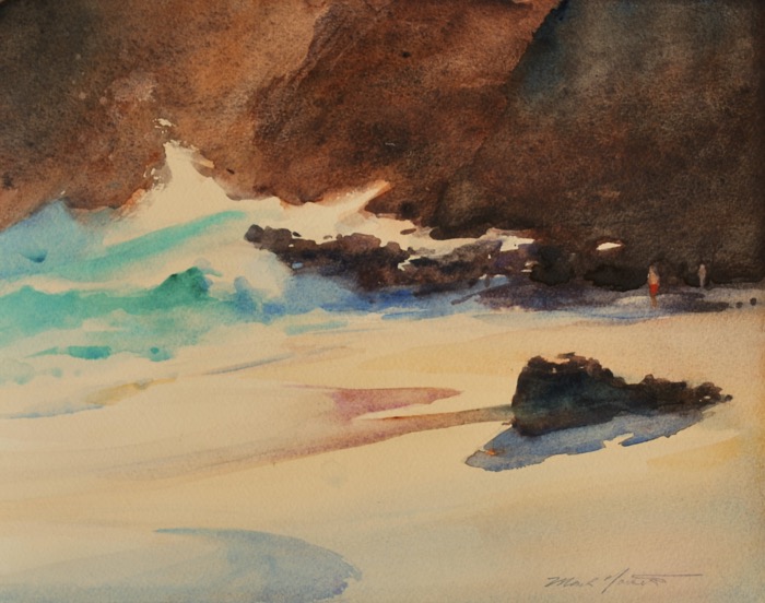
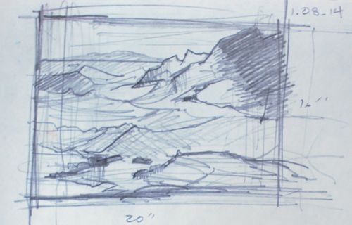
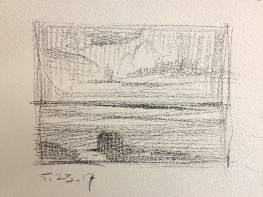
This pencil drawing, from my prior post, remains as a solid summary of what I’m after in my final piece.

I’ve relied on it to refresh my memory…in the heat of  constructing a night painting, it’s easy to gradually lose oneself along the way.  One needs an anchor, a plan, and I’d be lost without it eventually.

composition sketch
Small Pencil Sketch

The Essential Question

So, what am I after?  It’s hard to know with certainty. It’s not a commercial question, though it’s a given that I’ll be doing my best to make it as beautiful as I possibly can. But there has to be something communicated, something that I see and consider worth attempting to help you to see. And as I progress through these stages of organizing the picture, that’s the thing to be cleared up.

Right now, all I know is that I want to create an emotional response like what I’ve experienced at night, out on those cliffs. And to communicate it clearly to others. I hope that this basic motivation will become more nuanced as I proceed.

The Practical: Finding My Way

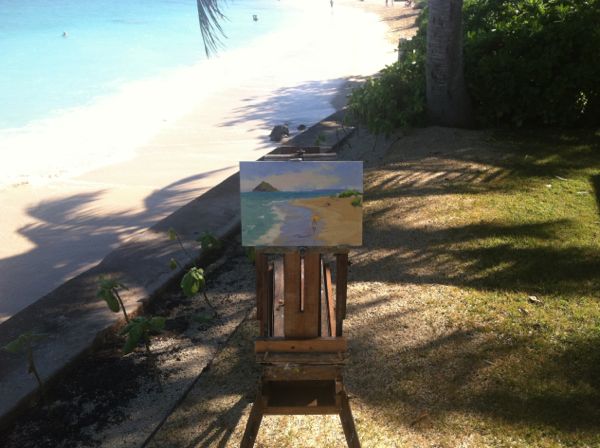
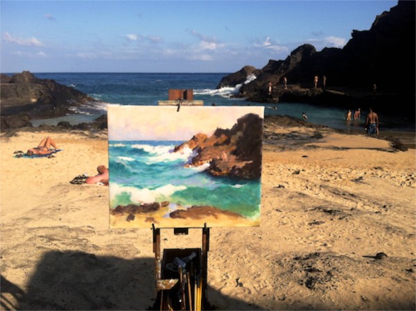
One of the particular difficulties is that the final painting must be done in the studio, and from studies that cannot be executed directly from nature.  It’s too dark outside.  So my “visual memory” must be sharp and reliable enough to put things together. And that’s not a clearly established procedure like some other aspects of painting.  I’m finding my way gradually.

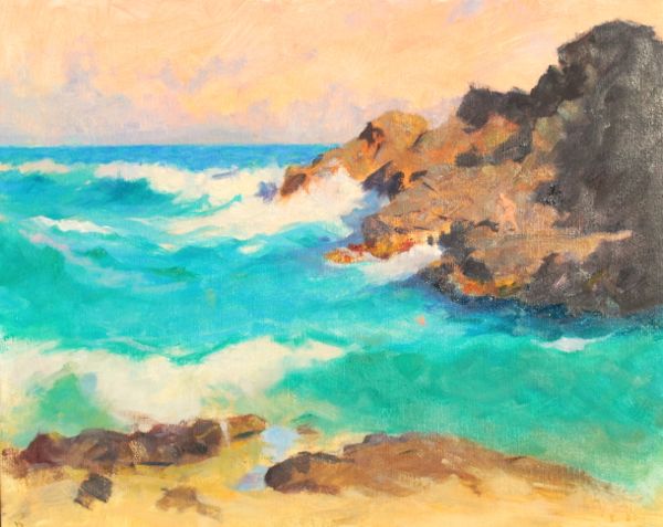
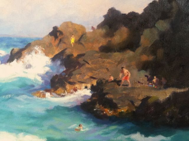
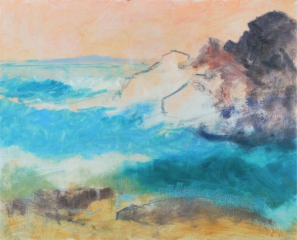
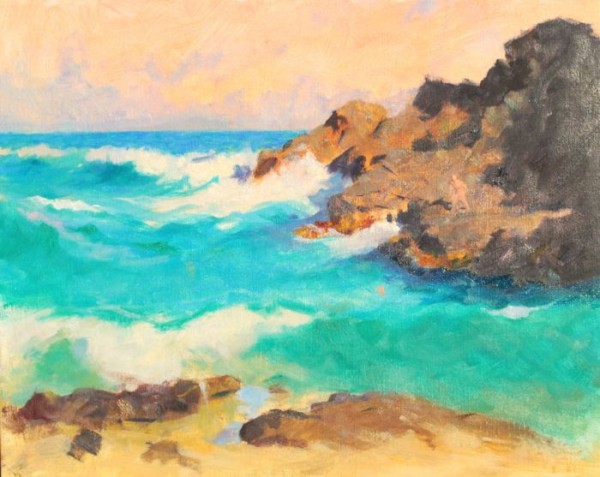
At this point I’ve determined that the next step forward, now that the basic color/mood sketch and thumbnail are established, (here), is to make studies of the clouds.  They are the most complex and dramatic elements in the painting.  Accomplishing this will enable me to work out  my composition intelligently.

The Cloud Studies

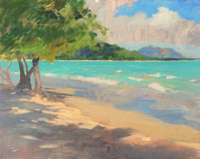
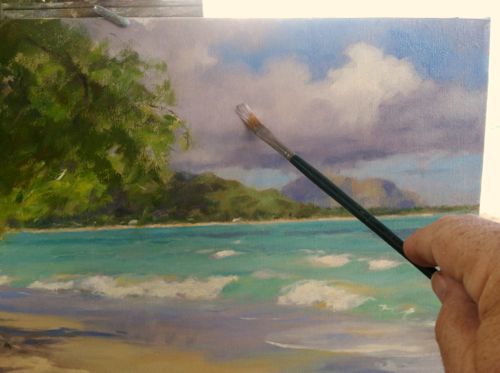
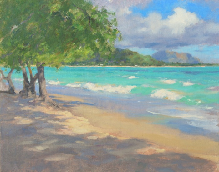
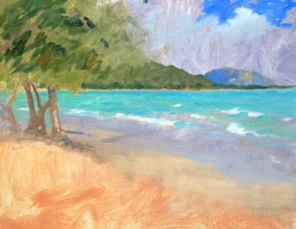
I painted three main cloud studies from a nearby hilltop over several sessions.  I sketched in the ocean beneath  for scale.

It’s crucial to decide where the light source is to be in the final painting.  I’ve decided it will be the moon, and positioned directly above the view, and out of the canvas.  This was established in the thumbnail sketch. This is an important consideration and especially for a night painting. I want the moon outside the canvas because I would like to attempt to suggest it’s effect without including it.

Because of this, I hit upon the idea to paint the cloud studies outdoors at noontime, when the sun illuminating the clouds from directly overhead would replicate the moon at night.  I could then paint the forms I saw being created by sunlight on the clouds with confidence that they could translate into the night time effect by adjusting the values.


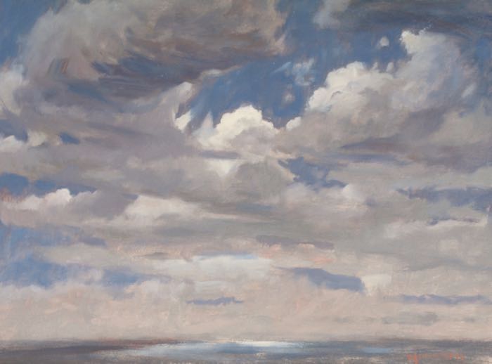
The cloud studies in order, 11 x 14″ each.

cloud study 1

norseth cloud study 2

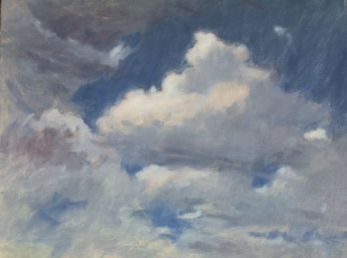
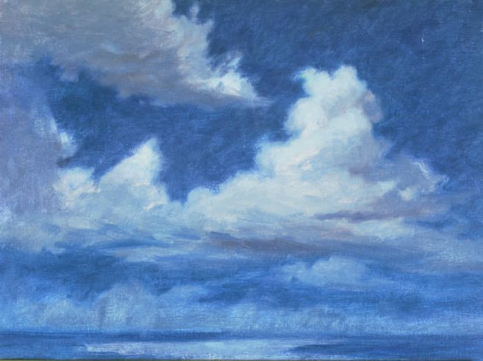
These studies were essential and are extremely useful…not only for a night painting, but as contributing to my general knowledge. I know that work one does from nature, with all it’s hassles, roots itself in an artist’s mind in a unique way.  And they were great fun to work on!  Forms like clouds need to be rearranged and manipulated to move the eye within the painting; I’ve come to know that clouds are among the most flexible and reactive of the forms occurring in nature.  Full of surprises, expressive, and very, very beautiful.

I’ll be springing the final study in my next installment. Mahalo (thank you) from the South Pacific!


Mark

A Lingering Painting Revived

There is something to be said for hanging on to work that seems to be going nowhere. Can a lingering painting be revived?

This is a quarter sheet (11 x 15″) watercolor that was in a stack of unresolved pieces that occupy a drawer or two in my flat files, an Elephant’s Graveyard where works on paper (quite a few) are exiled when they refuse to stay airborne.  Sometimes they see daylight again and come back into usefulness as the backside of a demonstration piece or practice sheet.

At the End-Makapu'u

Makapu’u -End of the Beach  11 x 15″    Watercolor

This painting was probably started around three years ago from a plein air trip to this end of the beach.  It caught my eye the other day…I remembered giving it up as being rather dark and unappealing.  I was originally trying to go after the colors in the water using the darkness of the cliffs as a foil but didn’t feel it had a sufficient exit for the eye and lacked variety in the color.

Approaching it as a stranger now, I could see that with the addition of a few minuscule adjustments I could possibly bring it back to life.  I lifted some paint for figures to provide some sense of scale, lost some edges, and deepened a wash or two. Not more than 30 minutes effort.

The lesson I take from this is that it’s sometimes good to work on multiple pieces and move from one to the next. When you reach an impasse or lose your enthusiasm….just give it time.  There is no expiration date on a painting if the underpinnings of a decent idea might be lingering, waiting to be revived.

Lanikai Beach: Moving Targets, Straight Paint

It seems that this time of year I regularly find myself scouting for interesting subject matter in Lanikai, a beach spot not far from home. I begin early and drive the main road past Kailua Beach which then rises to the splendid overlook.  I slow down to glance North, across the bay towards Mokapu, and then bend around to follow the one-way loop into the community of Lanikai.

Lanikai, like most other now-famous beaches, was once an isolated and rather barren spot populated by families of Hawai’ian and Asian descent.  I’ve heard folks who lived here during the 1930’s speak about how farmers raised melons to trade for rice with farmers back in the mountains. Cash money was rare. Fresh water could come from holes dug in the sand, there was no electricity, and people birthed their babies at home.  During the war, barbed wire was stretched along the beach.

Nowadays Lanikai is known, and it’s a different deal. Populated by part-timers and foreign visitors as well as locals, it’s become increasingly affluent and crowded.  Sniffy, expensive California styled residences are on the rise and crowding the view. But there still are tiny slices of the old tucked away in corners and unexpected places, and it’s to these that I’m attracted.

Scouring and squinting, I often think that I must appear suspicious to residents as I slowly creep along in my chang-a-lang Rav 4,  peering into yards and empty lots.  I’m checking my rear view mirror for a view of how things appear behind me.  I climb out of my car at odd intervals to study combinations of buildings and flora, dark and light patterns, or spots of color…anything that might hold some promise of becoming an interesting composition.

And so as I went ’round the loop (it’s a single lane, one road in and one road out), I was able gradually to narrow my search to a few possibilities.  Though it was early in the day yet, the sunlight was strong and the sky clear. Streets were already filling with people hitting the beach or doing the holiday yard sales.

Then, out of the corner of my eye, I caught a glimpse of something good.  Dark and light foliage, a flash of  white wall/blue sea on the Makai (ocean) side of the street.  It was a small beachfront property I’d somehow never noticed before. Big modern places had been built closely on either side. Yellow sunlight cut across the darkened entry road  and there were hints of ’20’s-era architecture silhouetted in the dark overgrowth of palms and hedges.

 A Friend Indeed

“No way I am going to get to do this”,  I told myself as I skeptically considered the odds of obtaining permission to paint here. It’s no fun knocking on doors and explaining to people you’re a painter. Try it if you haven’t. And Lanikai has it’s guard up these days… understandably so.  The normally friendly residents have already been tested by the abundant supply of tourists errantly drifting through their yards, as well as out-and-out thieves.

But I was about to be surprised.  As I poked around across the street looking for a vantage point that might allow a shot at this, I saw a big contractor’s truck parked where I hadn’t noticed it on the lot.  And the name on the truck was the company that my pal Brian builds for.

What do you know about that?

And as I’m taking all this in, my feet have me automatically walking across the street.  Hope is like that, I’ve noticed.  Your body just responds to it before your brain has weighed the matter entirely.  But no matter, because at that moment my friend Brian has emerged from a dark doorway, his mind on 20 different things to do with his project.  He then sees me, looking dumbfounded at him.  What are the odds of this? We greet each other.

Yes, Mark, you can have the run of the place if you stay safely out of the way.

IMG_0462

Well, I’ve gone from mild despair to elation in a few minutes.  I thank Brian ( I’m STILL thanking him!), grab my trusty & rusty Julian 1/2 box, and after some deliberation regarding what to paint ( so many choices and so little time) I decide to jump on a rare opportunity to paint the beach from about 15 feet above it.  Looking East, from this incredibly well shaded perch,  Molokai is beautifully silhouetted and the sky and sea are dazzling. Visitors are walking the beach and the colors are beautiful.  Everything is moving, and it is as strikingly clear as one could ever ask for.

Straight Paint  

Unlike many oil painters, I received a lot of practice working with oil paint that is straight from the tube.  This is a hard sell to some painters because we mostly receive the idea that things have to be done to oil paint, added to it,  to make it manageable .  While this is desirable in some instances, it’s not necessary in many cases…and certainly not in this case.  I’d been working with an addition of some linseed oil lately, and also using a traditional 3 part medium for a change after years of straight paint.  On this occasion I left the turpentine (Gamsol actually) at home,  and worked with straight paint on a white oil primed linen panel. I’m happy I did.

It was delicious. Starting with the large masses of sand, sea, and sky I dropped in the large blocks of color with “tiles”, brush strokes of pure paint laid side to side, each mixed to directly capture the color and value needed.  They can be fused and modeled later. This was referred to as “Bunkering” for  the 19th century American painter Dennis Bunker by one of my teachers, James Childs. It’s work at the beginning, especially if one is accustomed to beginning with a thin wash of color that hides the white of the canvas.  But the pay off comes later, because once the painting is covered, the second round of adjusting the shapes and values in this rich lay-in is a real pleasure.  The right amount of paint is in place to model forms and the work almost becomes easier…certainly for me more enjoyable.

And so the morning went….figures briefly appeared that were desirable, though fleeting. The woman with the umbrella was only present for a minute at most…so I have developed the habit of notating the figure on a clean area of my palette, a quick gesture with color, enouch to recall the effect and place it into the painting wet into wet after the general effects of the painting are painted. Her companion was added from a memory sketch the following day.

Lanikai

Starting & Staying Fresh-An oil painting in steps. Part 3

The weather has been challenging; a hurricane was anticipated and this kept me off the beach for several days.  But, we dodged another one and so, thankfully, we’re back with good weather again.  And I’m happily re-engaging with this painting.

Staying fresh is a matter of exercising taste.  A composition has a point to it, a purpose…and if the artist identifies what the point is early enough, questions of what to include and what to eliminate in the painting are answered by whether they help or hinder the desired final effect.

I’m largely concerned with getting the feel of the light…I mean the color of  early daylight on the various elements, and making something beautiful with the composition by  leading the eye through the elements in a pleasing way. Everything I do, anything I add or subtract, should contribute to this purpose.

Here’s where I left off:

Second day's work

The composition is firmly in place and I’m satisfied that I’ve done as much as I can with the basic shapes.  This is, essentially, the painting in terms of design, that what we will irrevocably be “living with” in terms of the pattern of shapes. Today’s and future sessions will be devoted to bringing the painting up; that is, bringing things to life in terms of my objectives.

I’m also wary of overshooting the mark…one can lose the overall unity of the painting by getting caught up in parts and details, observations that don’t contribute but actually clutter the painting.  I’ll need to be very aware, especially when it becomes overcast for lengthy periods because  I can overdevelop an area while waiting for the light to return.

Resuming the Work

After setting up at my location, my first step is to address whatever area of the painting is most out-of- step with the painting’s progress.  In this case it’s the furthest area of the landscape, the sky and clouds in the right background.  Since I have a nice sky today I can easily jump in where I left off before.

The whites of the sky need to be adjusted down a slight bit from the whites in the waves, in order to keep them back in the painting.  This means graying them slightly.   So I mix a slight gray using Titanium white, Ultramarine, a red (Indian, Cadmium, or Light Red), perhaps some Yellow, usually ochre for this time of day,  and place this in the sky loosely.  By loosely, I mean I create a shade of the right value from these various colors, but do not mix them so completely that the colors  lose their individuality. This provides  a tone of a single value but with varied color temperatures in it.

loose gray

The clouds are in motion and the sunlight falling upon them is changing rapidly, so with this light gray in place over all the cloud masses, I can move shapes easily into a more satisfying design.  The effects of clouds on the demeanor of a painting is worth noting as they can help express many different moods. Clouds have a lot of personality! I refresh the blue of the sky with Cobalt blue, a thin layer brushed over the prior work.  With this I can paint edges of white and blue into one another, creating softer edges on the forms.

greying clouds

As I work on this, I eventually find myself over working an area, so I make a point of leaning away from the work (I’m seated) and actually keeping the seat at a distance from the painting so that I need to extend my arm  to paint. The idea is to keep me from getting nose-to-nose with the painting.  I also use an overhand grip on the brush, so that I can hold it with the brush handle cradled in the palm of my hand…this also keeps me back a bit more from the painting. And I try to move from area to area. Water, sky, shadow, light.  Moving all the areas slowly forward, but (hopefully) in a way that stays unified.  If an area is worthy of the eye’s interest , then I will develop it more carefully.  If not, I will try to simplify it as much as I reasonably can.

One of my main areas of interest is in the colors of the shadows in the foreground.  I find such areas to be quite beautiful in themselves. So I enjoy finding color combinations that work within the general value of the shadow, broken colors applied with varied brushstrokes that combine to create vibration of color like what I’m seeing.

As the session draws to a close, I’ve made changes in almost every area of the painting.  Lights and darks in the trees, enhancements of the waves and reflections in the sand, and more refined observations in general.

part 3 image

I’ll be writing another post on the painting soon.  Thanks for the coming along!

Starting & Staying Fresh- an oil painting in steps. Part 2

Fortunately the weather is looking generally cooperative for this second session.  After arriving at the location and setting up, I take a few minutes to compare what I’ve gotten so far  in relation to the actual subject.

I look at the large shapes (also refereed to as “masses”) of trees, ocean, waves,  sand, hills, etc. and see if they are as I want them.  This is the basis of the design, and what we’ll be living with after the painting is completed. Then I check the color of these masses, color which at this elementary stage is relatively flat in character, middle tones thought of  as puzzle shapes fitted against one another. These colors will be developed and refined in the ensuing sessions.

Here’s where I left off yesterday:

16 x 20"
16 x 20″

By assessing the oil painting next to nature, I decide to begin by simplifying some shapes and values to make them work better.   This first part of the morning has interrupted sunlight…clouds move in, and I suddenly have very little to work with in terms of light and color.  When this happens, I always choose to refine and adjust shapes, which are not so influenced by the light.  In this instance it’s the tree trunks and wave shapes which I refine while I wait for sunlight to reappear.

The light returns and I’m  now free to move ahead with the next step, which is going for the shadows and color on the sand. These colors are tricky; they change from warm to cool quickly as the morning progresses.  I know from experience that the shapes become decidedly bluer, so I decide to go with the slightly warmer notes I observe earlier and which I mix with a scramble of ultramarine blue, terra rosa or cadmium scarlet, ochre and white.  I enjoy painting these sorts of passages, and go in with this basic violet shadow value over the prior day’s warm ochre wash, using a large egbert, and break light selectively into it with a separate brush.  Once that shadow shape is in place, nuances, eye path (where the spots of light lead the viewer) and refining the value and color are my preoccupations.  I try to keep the brushwork simple and suggestive.

Stepping Away

I can’t stress enough how viewing and working on the entire painting as a whole benefits the outcome.  Stepping back often, viewing the painting through a small mirror, trying to always consider additions to the painting in terms of their impact on the whole painting.   This leads to unity in the picture…the sense of an easy look to the final painting.


Second day's work
Second day’s work

By the time this session winds down,  my subject has returned again to glorious full sunlight and I’ve been able to work and adjust overall color, which is refining the prior days laid-in color with additional observations…working around every area of the painting, keeping the entire picture advancing forward. Sort of like a cattle drive in a Western movie.

After bringing the painting back into the studio, I always make some adjustments to the days’ work, which are almost always simplifications of form or value.  I let the painting dry in the sun a bit, and look forward to day 3.

The news reports that a Hurricane is brewing offshore,which may or may not interrupt my little agenda.  But we’ll see.

Thanks for coming along with me!

Starting & Staying Fresh- an oil painting in stages. Part 1

Although I’ve painted along this stretch of beach for years, I still find myself intrigued by new possibilities for richer and deeper expression in these subjects.  The “hook”, the thing that continually catches my eye, is the remarkable brilliance of light and the presence of life and energy here.  My mission, the “art” in this,  is to relate it (this sensation/experience) to others.

This needs to be stated as much for my own benefit as yours because  the challenges of outdoor painting are formidable. Losing the whole point of the painting in the struggle of making the painting is breathtakingly easy, and so I need to remind myself  of my mission frequently.

16 x 20"
16 x 20″

This piece began with basic pencil sketches worked out prior to actually beginning painting.  It’s very important to make a plan about placement and pattern in advance.  Once I begin painting, color, value  and the light effect are plenty to occupy me and not the time to wonder where I’m going compositionally.

The First Session

Arriving early and setting up at the location with a 16 x 20″ white canvas,  I make sure that the light on the canvas is not bothersome, that the wind is manageable, and also that my location will remain in the shade for the next  1  1/2 hours.

With my palette set up in my usual fashion, my first objective is to get my largest shapes in place. I begin by placing the horizon line and tree trunks with thin loose strokes on the white canvas.  That’s a pivotal juncture in the design and the other shapes (ocean, hills, sky, and sand) are positioned in relation to them.

Using large egbert brushes and pigment slightly thinned with Gamsol  I then lay-in all these masses in flat general tones,   in overall color as close to nature as I can get them. This process takes an hour or more.  No details. I keep the edges of masses fairly “lost” in most places.

I really try to be fresh with the brushwork ….an energetic start with large, flexible  brushes can’t be a bad thing at this stage.  I work the strokes in various directions, often attempting the unexpected  ( like pulling the sky tones downward, the tree trunks painted with horizontal strokes “across the form”, etc.).   The whites in the clouds and waves are actually greyed down a couple steps so that the actual brilliance of these highest value notes can later be built and adjusted over the grey.

Everything is kept simple  and  painted as freshly as possible. Although I’m seated for this painting, I work at arms length from the canvas and step back often, so that I’m always viewing the entire painting rather than focusing too much on the individual  parts.  Whatever redeeming qualities the final painting may eventually have are being established now.


Long filbert brushes (egbert) for lay-in work.

After about two hours work, the light has changed enough that I need to stop.   Paintings of this sort are always a survey of the light effect, not (as in a photograph) an instant summation.  As this painting progresses, the window of working time will narrow because I’ll have a better grasp of the light effect.  In ensuing sittings the point will not be to add more stuff to the picture, but to select and refine relationships and beautify what nature is providing.

So, it’s a good start.  I look forward to continuing the momentum tomorrow, weather permitting.


More coming soon, and thanks for joining me!


Halona Cove Oil Painting-Part Two Painting the Ocean in Hawai’i

Welcome back.

The painting of Halona Cove was at this stage where I left off in the last post.

DSC_0006 Divers,  Halona Cove  16 x 20″, oil on stretched linen

At this stage of the painting the pattern of the shapes (land masses, “whites” of the waves, the shape of the dark shadow, figures, and simple color)  are all in place and ready for further development where appropriate.

This stage is the structure of the painting;  if I have any misgivings about the composition they must be addressed by now. A figure is suggested among the rocks, and  in the water as well.

Step back before moving forward

Before I move forward in this next plein-air session, I pause to refer to my original concept sketch to see if I’m heading where I’d intended.

NOTE: When painting outdoors, and probably even more with the ocean, it’s very easy to get seduced by all of the activity in the subject…and led away from what is important, the strategy of where the viewer’s eye travels in the painting, and what it finds along the way.  I always have to watch this carefully.

halona pencil   Using the original sketch to reaffirm my goal of the work  (essentially, capturing the light of this time of day in this particularly powerful  place in an energizing way) I set up my easel for a third , (or is it now a fourth?) session.

Building and refining the colors and values

The weather has been really kind. That means the light is the same as last session, and  I’m able to get down to work on the various “notes” of color, and developing the dark/light relationships.

I’m also trying to keep the brushwork  fresh  and descriptive, and especially while capturing the colors in the water.  Unlike some other painters, I seem to use a number of brushes at this stage, possibly as many as 12-15.  This way I can keep each note of color distinct and  get the stroke in the shape I want.

My palette for the water  includes Ultramarine, Cerulean, Viridian, and Yellow Ochre, possibly a touch of a Cadmium Yellow. Darks can be helped in the water by a bit of Alizarin Crimson and Viridan, which creates a fascinating transparent grey that is very suitable for this work. At this stage the “whites” are keyed down to a lavender gray of varying warmth and coolness.  There is probably no “straight”, pure white in the painting. I’m also using a Schmincke Manganese Cobalt Blue that I believe is helpful. And there is Ivory Black on my palette, which I find helpful  and useful in the darks.


Halona 3 detailjpg

Painting the figures

The figures are ready to be placed directly into their positions and I do so, referring very loosely to actual figures in the scene before me for color, but still relying on the sketchbook drawings for position and gesture.  They form a generally pyramidal  shape as a group, and I push the gesture and color as far as I can without losing  the simplicity of the brushstroke.

The water and especially the whites of the waves also receive more attention. I’m building up the paint so that these loaded whites physically catch the light falling onto the canvas in a way that contributes to the sense of foaming, breaking , dazzling white water.  These whites are a powerful compositional tool….where they are placed is where the eye will go, and their shapes should work on the canvas as an effective design  pattern.  I find that to be much more important than clutter or details in the water, as I mentioned in the first post.  The whites are also warmed or cooled, sometimes rather subtly,  to create variety.

DSC_0003 - Version 2

So as I develop these concerns,  I’m aware that the painting is reaching a point where any further work will not really help the overall look of the painting, but actually start to work against the vitality that I would like it to possess.

After adjusting some more elements, and defining ever so slightly the island of Molokai off on the horizon,  I then back  away from the painting for a day or two,  then give it a fresh look and decide that it’s ready to be signed. DSC_0003 - Version 3Divers, Halona Cove  oil, 16 x 20″   January 2013

Thanks for your interest in reading the post, I hope it’s interesting and helpful!


Halona Cove Oil~ Part One

I’m really enthused over working out of this lovely cove again, and the watercolor (see previous post) was an ideal way to break back into it.

I like to paint with a goal for the work, and by that I mean a motivation or reason for pursuing it artistically.  This subject has distinctive elements and challenges that make it quite unique… it’s beautiful and it’s a bit dangerous here… and it doesn’t “pose” for me, it’s all in constant motion.  Very challenging to work directly from.

Opposites Attract

Consider lights and darks; in one glance you have the brightest of whites  in the light and the darkest of shadows,  for color there are warm earth tones opposed by our shattering blue-greens. Lines are jagged or curvaceous, or even perfectly straight. The masses are dense, bulky and immobile in the rocks, or fluid and streaming in the water.  Everything is in opposition, and  it’s all interconnected within itself.

So with all of this packed into one small area, it warrants my best effort.

My first composition, from the prior watercolor, has led me to focus more on the distant figures and the contrast they present against the rocks as that incredibly dark, end-of-day shadow quickly draws itself across the cove.

But before any of that, I have to design and place the big shapes.

Here’s the first afternoons progress:

Halona Cove, first lay-in 16 x 20"

I worked until the light failed, after 4:00, and then made some mental notes of the figures that I observed around the rocks.

Back to work

I was fortunate to have several consecutive days that offered essentially similar light, so returned at the right time to continue on the painting.  This is a matter of seeing that large shapes are where I want them, and making certain that the color, which is perhaps one of the things I try to be most genuine about, is true to nature. The motion of the waves has to be thought through…the powerful white of the waves draw the eye by contrast, and I want them to create a rhythm that moves across the painting successfully.

Halona Cove ll

At this point I’ve begun to indicate a key figure, but haven’t yet made up my mind about the pose or position in the painting. Colors have developed another step, and the rhythm of the waves is being worked out.  I find that this stage is much more important than noodling the painting of the waves in a more precise manner…that sort of work won’t help a bad pattern.

This was a good afternoon’s work.

Working out the figures

I spent some time and sketched out some possibilities from memory.  Since they are tiny, I’m not concerned too much with the figures beyond their possessing an accurate sense of the light,  good proportions and gesture.

DSC_0001

Halona Cove  oil in progress, 16 x 20"
Halona Cove oil in progress, 16 x 20″

I’ll continue this post when I have more time!  Thanks for reading.