Back on the Beach~Halona Cove

Because of the stunningly clear weather we’ve enjoyed recently, I’ve made my way back down to a subject that is always in the back of my mind, Halona Cove. I’ve worked here before,  and often, but  am always happy to return…and hopefully get a bit closer to capturing that sense of absolute awe that I feel here.  That the neighbor island of Molokai was clearly visible was an added attraction.

FYI, this is also known locally as Eternity Beach  (due to the famous 50’s film “From Here to Eternity”, with Burt Lancaster and Debra Kerr memorably rolling passionately in the surf at this very spot).

Of course that has nothing to do with my own interest in the subject…I’m motivated by the beauty, power, and brilliance that is packed into this tiny cove.  I might also add “joy”, because it’s a delightful place for those who make the trek down into this canyon-like inlet.  The visitors here, whether locals or visitors, are in a unique place and know it. So I want the work to contain some of that.  The brilliant water, the jagged and dark lava combined with dazzling sunlight, create some remarkable visuals.

Making It Happen in the Moment

I began with a watercolor, which occupied two sessions on an especially clear set of days. The drawing of the figures and general composition came quickly. The actual painting took two sessions because of the fleeting light effect. Once the shadow of massive Koko Crater begins to fall on the beach, it’s dark shadow almost rushes  across the scene in a dramatic fashion, highlighting  the various  areas of the painting but momentarily.

DSC_0009

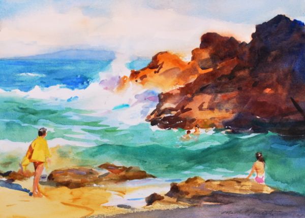
Sunday Afternoon, Halona Cove  Watercolor on Arches Cold Press  10.5 x 14″

This turned out just as I’d hoped, and from here I decided that I had a handle on a new oil painting, which is what comes next.

Sunday Afternoon, Halona Cove available for purchase here


Cinderella Greys

It’s been a while since I’ve had anything large on the easel, and so I’m excited to have this new painting under way, which hopefully will figure nicely into a show scheduled in November.

It began a few weeks back with a fast, last minute sort-of watercolor sketch when the light unexpectedly illuminated the grove of Ironwoods on the right.

light effect/composition sketch 5 x 7″ watercolor

I find it profitable to do the first round of composing in watercolor…I experience the effect and get it under my skin quickly,  and if it doesn’t work, I see it without a big commitment of time, plus I have a sketch for the archives and to pull out down the road when hunting for some fresh inspiration.  I think I use sketchbooks and watercolor somewhat in the same way that a lot of artists have used the camera, which I’m still unable to get enthused over.

Since this was promising, my next step was to return to the location and work up this small oil painting  to see what the possibilities were.

sketch, 8 x 10″ oil

That went well enough and the final painting, shown below,  was begun last week, this image showing the second session’s development

untitled, 20 x 36″ oil on panel

Now that I’m on to the final piece, there’s so much to respond to in this subject…the constant fluctuations of light and color at this beach keep me moving all over the painting, trying to allow the light effect to remain the principal thing;  how it passes across the face of the cliffs and the very real inner illumination it provides the grove of trees.  Textures are everywhere in the lights and halftones, many opportunities to be pretty rugged with the paint itself.  I hope to get some real surface charm into this painting.  But these strange greys are the thing that are making this painting work.

Mysterious, evasive, improbable combinations of cool blues and warm reds that would be unattractive if isolated from the sun-drenched passages that they are joined to, but that perfectly support them when unified.  Maybe I should regard them as the Cinderalla colors of painting…I believe I enjoy dwelling over them more than the obvious, luscious colorful sections.

Two Ideas

Two principals I’ve come to understand over the last few years:

There are no unattractive color combinations in nature.

Crazy thought maybe, but I think it’s true.  I cannot recall seeing any naturally occurring combinations of color in nature that were not somehow harmonious and appealing, though the individual component colors may not be, and often aren’t.

The novice seeks to improve his paintings by adding details. The artist does so by simplifying and refining relationships.

I put that thought out for my students, many (if not most) who are struggling with learning to work with the great generalities in their paintings first.  It finally came to me while laying in a landscape painting and took me a good long while to get it into two sentences, and it probably could use refining.  But it’s true.

Any thoughts?