There is something to be said for hanging on to work that seems to be going nowhere. Can a lingering painting be revived?
This is a quarter sheet (11 x 15″) watercolor that was in a stack of unresolved pieces that occupy a drawer or two in my flat files, an Elephant’s Graveyard where works on paper (quite a few) are exiled when they refuse to stay airborne. Sometimes they see daylight again and come back into usefulness as the backside of a demonstration piece or practice sheet.
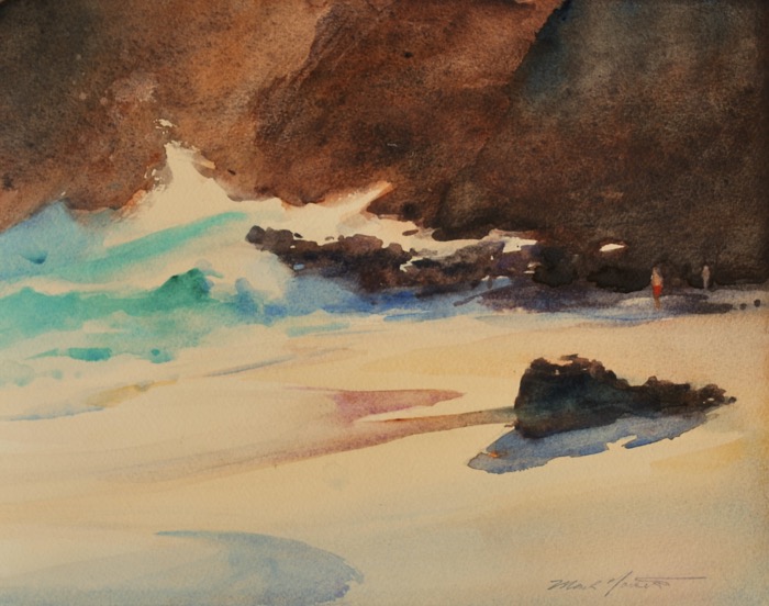
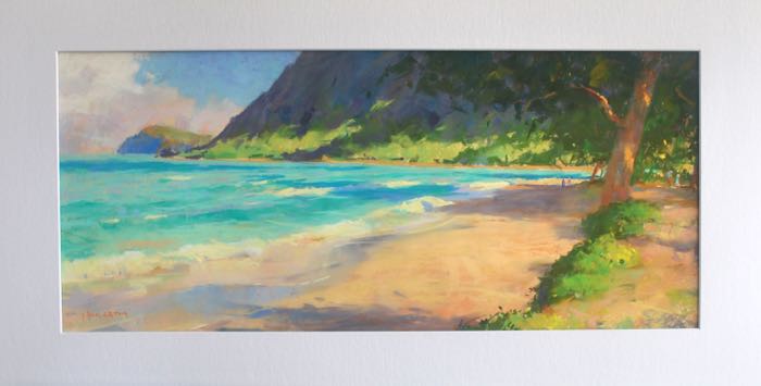
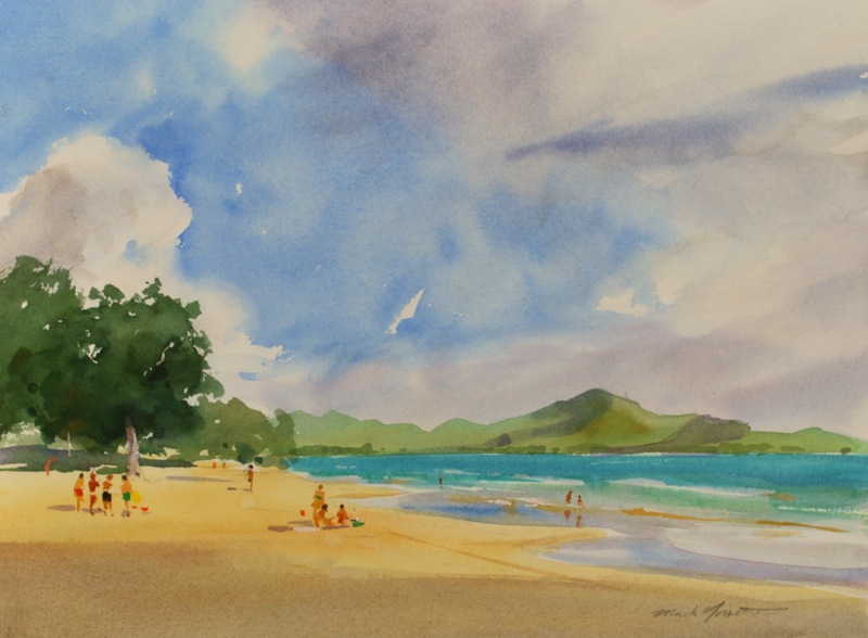
Makapu’u -End of the Beach 11 x 15″ Watercolor
This painting was probably started around three years ago from a plein air trip to this end of the beach. It caught my eye the other day…I remembered giving it up as being rather dark and unappealing. I was originally trying to go after the colors in the water using the darkness of the cliffs as a foil but didn’t feel it had a sufficient exit for the eye and lacked variety in the color.
Approaching it as a stranger now, I could see that with the addition of a few minuscule adjustments I could possibly bring it back to life. I lifted some paint for figures to provide some sense of scale, lost some edges, and deepened a wash or two. Not more than 30 minutes effort.
The lesson I take from this is that it’s sometimes good to work on multiple pieces and move from one to the next. When you reach an impasse or lose your enthusiasm….just give it time. There is no expiration date on a painting if the underpinnings of a decent idea might be lingering, waiting to be revived.
On many occasions, I’ll find a subject that requires an immediate response, so I take the plunge. But either weather, the poor quality of the light, or other circumstances make an in-depth plein air study hard to manage.
So, oftentimes I’m disappointed. The results of these plein air sketches are not as effective as they would be if they were more fully developed. And almost always the main weakness is in the composition. Either nature didn’t provide (or I didn’t recognize) a suitable arrangement of elements to make viewing the painting a fully satisfying experience.
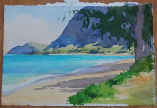
This sketch (above) is a 7 x 11″ watercolor that is our case-in-point. It was sufficient in a no-frills way to capture the general effects. But the sunlight was on again/off again, I had interruptions from rain, and the composition now seems crowded into the rectangular format.
A Reminder and a Reference
The sketch’s real value to me is only this: when reviewed later, after I’ve moved on to other work, I’m reminded of visual/sensual experiences ( I mean sounds, smells, circumstances) that are now part of my memory. It conjures recollections much more like a movie than a snapshot. The sketch has become a reminder and a reference.
What artists know is that sketching something plants the entire experience of being somewhere much more firmly in the mind than passive observation or photography. The information from sketching is sifted. More personal as well as visual, gathered through the lens of our own personal temperament. And this added dimension ultimately enriches the final painting.
From this stage, I’m then able to deal with the composition.
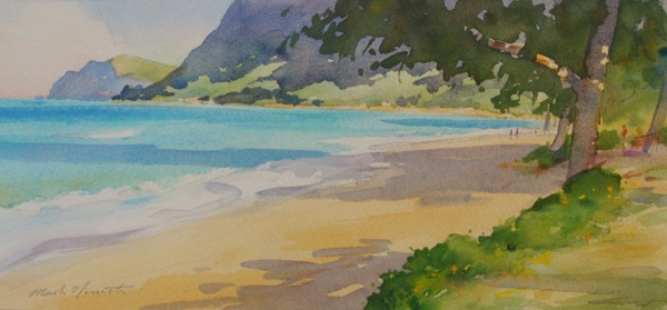
As mentioned, the first sketch doesn’t suggest the grandness of the place. It’s hemmed in by the rectangle and lacks clear areas of interest. So I put together this second study (below) in my studio, making better use of the elements that nature provided as well as altering the composition to suit my desire for a better eyepatch and more interest.
Waimanalo watercolor study, 6 x 14″
This small study is still “the place”, but is now better organized to lead the eye in an interesting way. The addition of figures and refining and simplifying the shapes now give me something with more pictorial interest.
A Point of Departure
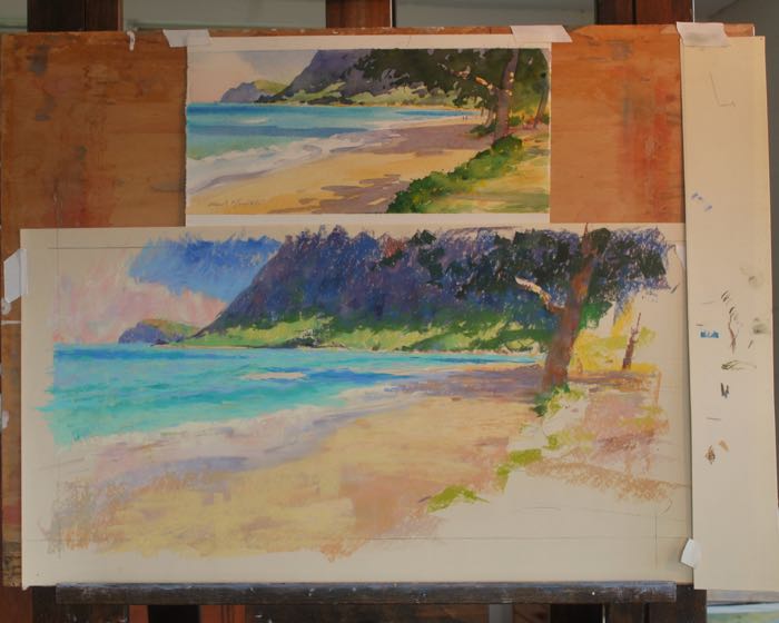
From here the watercolor can serve as a basis for many possibilities… an oil painting, a larger watercolor, or a pastel. In this instance I thought a larger painting in pastel would be a good response, to be worked up in my studio. So I used both the first sketch and study to refer to as I worked. I think I developed a better painting than I might have had otherwise…while making it much more “my own” in the process.
Here’s the easel setup with the watercolor study positioned so I can see it directly with the pastel painting. After several sessions I was able to complete the pastel.
And below is the final painting, now framed and in a private collection.
Makapu’u Head from Waimanalo, 10″ x 24″ Pastel. Private collection
One Final Thought
We obviously live in a time of technology, and the option of photography as a useful reference tool has been available and used by many painters for a long time. And undeniably, many beautiful works have resulted from this.
For my own efforts I have decided to invest in drawing and painting without the advantages/disadvantages of photography as much as possible. And I recommend that my students, while they are my students, try and do the same.
Art-making and life-living in our modern world have increasingly become solely results oriented. Labor saving devices are a wonderful blessing for the many people occupied in endlessly routine and stifling or tedious work. We’re thankful for labor saving devices whenever the labor is unpleasant, dangerous, or unprofitable.
But artworks are different. We are richer for the experience of interfacing with our subject over time, watching the many variations and possibilities, getting to know the subject in many moods.
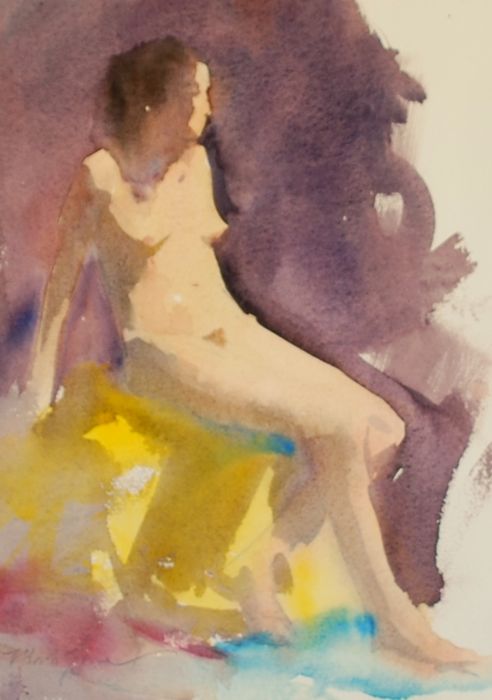
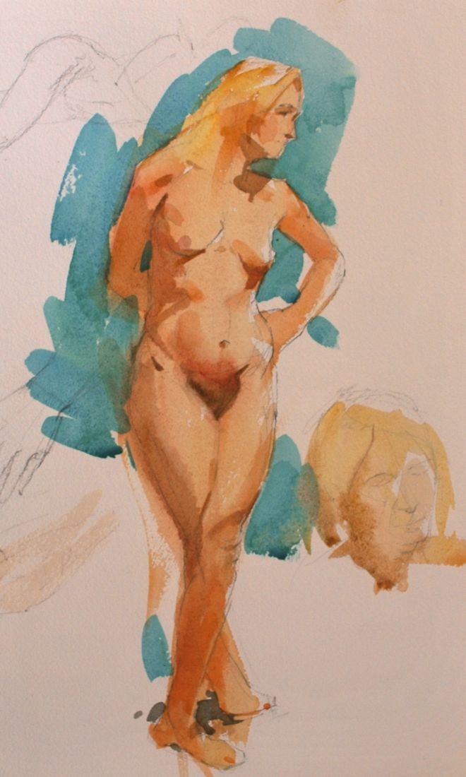
I love doing these small watercolor nudes from life. I find that when they work, they’re evocative, accessible, and an appropriate flowering of life drawing practice.
One big lesson from these paintings, and one that I’m taking to heart, is that too much information kills mood. The amount of information (details) brought into the painting needs to serve the painting and not become the point of the painting. So in this instance the viewer’s imagination gets to fill in the shorthand manner of the painting, which is always a good thing
Color and Shapes
These small paintings are shape and color arrangements, and those need to observably exist in nature, on and around the model, for me to get what I’m after. I’ve done some paintings from drawings after-the-fact, and they are sometimes successful. But from life always is preferable because of the immediate interaction. I suppose the mild tension of in-the-moment work with the model before me contributes something special.
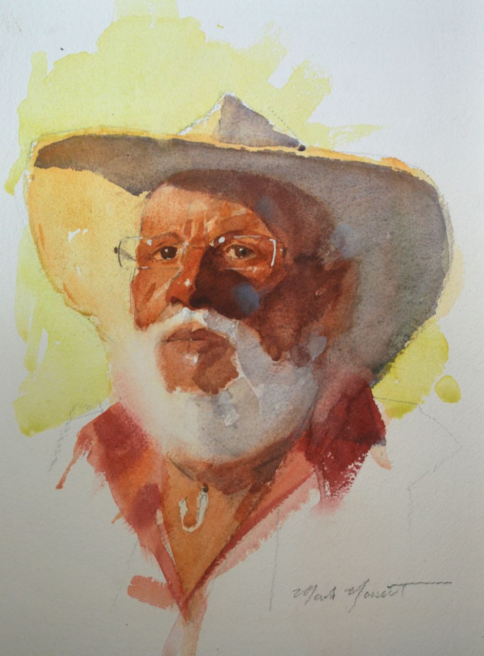
Particular subjects bring out a certain response from me, so while considering the few hours that we would be working with our model Lance, I decided that a watercolor portrait from life would be a refreshing way to capture this intriguing fellow…and introduce something a bit different to my students.
I don’t often advocate watercolor as a portrait medium because it’s drawbacks are pretty formidable, often outweighing whatever benefits one hopes painting a portrait in watercolor will bring. No corrections in the drawing are possible after a certain point. And transparent paint has color values that are limited…you can reach color notes in the high and mid range somewhat, but richness in the mid-darks and lower are a lot of work to achieve, and often not very successfully.
But if one wants a suggestive, informal piece in somewhat short order, this is a good way to go. There are certainly lovely qualities that watercolor brings to the table, and I like to take a crack at it from time to time. The great John Sargent’s portrait heads in watercolor have always been an inspiration…even serious oil painters like them! So despite my reservations, beautiful things have been done in the right hands, and we can try to emulate them.
Anyway, this painting was completed over two separate evenings in perhaps 4 hours; the first two being devoted to working out the pencil drawing as best as I could. So much hangs on the drawing being in place, especially with a watercolor portrait! Everything else came together very gradually, which is what I prefer. I’m not a great believer in quick production though it’s fine if it looks that way.
It’s painted on Arches #300 lb cold press, and measures 15 x 12 “. Watercolor, graphite, and opaque white.
Thanks for having a look, let me know if you agree or not with my assessment.
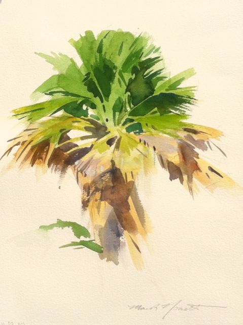
I got interested in doing some studies of Palm trees, and found this candidate over at the Queen Liliokalani garden near Diamond Head. Drew it in one short session, returned to paint it on another…always a good approach if possible.
These are exercises in mood and simplicity…I’m focused on shape and arrangement a lot more these days, trying to keep the paint itself as direct and unspoiled as I can. Just enough to spur an emotion.
11 x 15″ on Saunders Cold Press watercolor paper, my favorite.
Scouring around familiar places looking for a fresh subject-interest is one of my least favorite aspects of painting.
I dislike it so much that I think I’m actually somewhat opposed to it…because I’ve learned that such a search is really about my own frame of mind more than a lack in my surroundings. It’s fatigue, and in a way it’s a lack of gratitude, too.
There’s a beauty to be found almost everywhere…and I know how that reads, but I don’t mean that in a flippant way. I think it’s true. But I have to have the eyes to see, or appreciate, the familiar in a fresh way, and that’s not something that’s available on demand.
However, I’ve been at it long enough now that I know there are ways to work through it, and yesterday was one of the days where I managed to do just that.
In my Life Drawing Studio class, I sometimes enjoy adding the element of color when the pose is an hour or longer in duration. Watercolor is a convenient and sometimes ideal way to go…thoughI have to admit that if the drawing aspect isn’t working, no amount of color work will make up for such a weakness, and so I don’t recommend it to students until they are well on their way.
For anyone who wishes to give it a go, I ‘d recommend starting with monochrome wash until you’ve got a mastery over wash, know your brushes and paper (which need to be of good quality), and especially the drying characteristics of your paper. I use Arches 140 lb and Saunders 200lb, which are both great papers.
My normal watercolor palette, which is primarily used out-of-doors, includes the following colors that are perfectly suited for figurative work:
Raw Sienna, Naples Yellow, Cadmiums Orange, Yellow, Lemon, and Scarlet, Indian Red, Light Red, Alizarin Crimson, Permanent Rose, Raw and Burnt Umbers, and Ivory Black. These, in addition to the blues, greens and other colors I regularly employ, are a well rounded group for general painting indoors or out.