A Frame-making Morning

This is a quick post….I’m sanding the frame today for “Quiet Corner” and while waiting for it to dry I thought I’d snap some photos and let you see some of the work involved.

Handmade Poplar frame-Mark Norseth

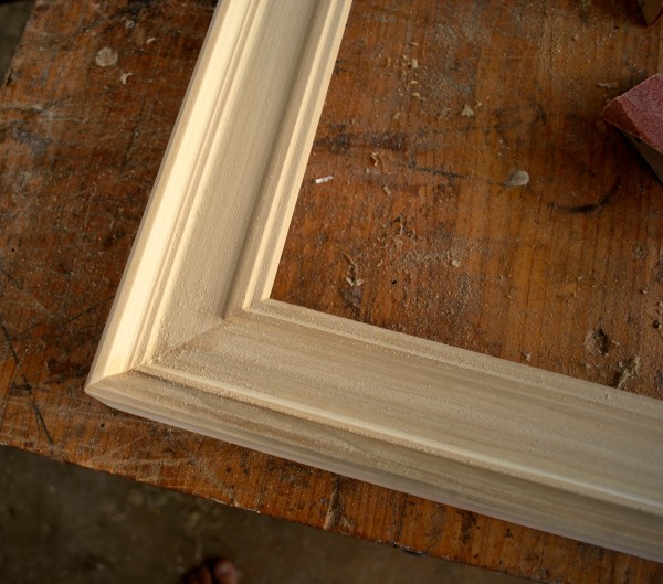
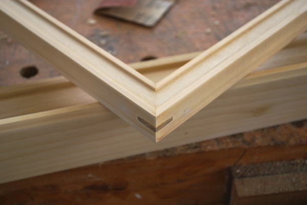
The moulding is one I make myself, from Poplar, using a selection of typical woodworking tools. Today is a sanding day, which I actually enjoy somewhat…it’s quiet and centering.  Frame making is an activity that complements painting nicely, though it’s very time consuming.

And here’s my disclaimer…I don’t recommend that artists make there own frames unless they really wish to.  I do so for a variety of somewhat unique reasons, but it isn’t for everyone.

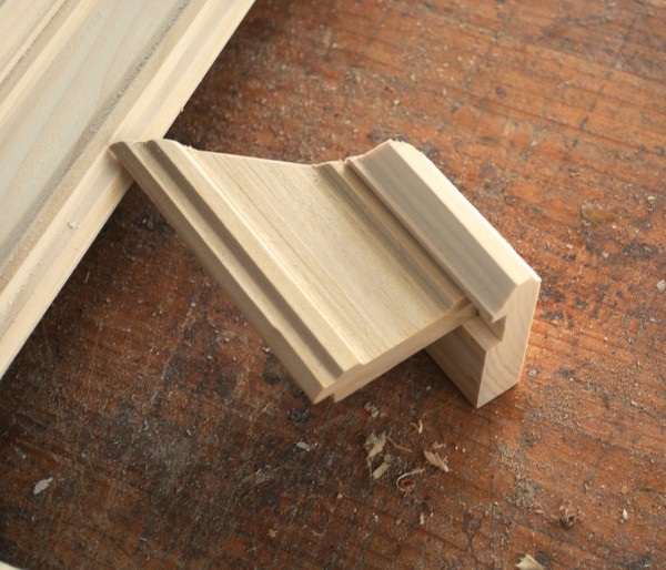
Corners are biscuit joined, which you can’t see because it’s internal, but it’s a great bond. The wood is sanded starting with 60 grit, moving through the numbers to 320 grit.  Hand-sanding will take around two hours, then finishing with various varnish and color combinations.  No gilding, I’m not there yet.

Moulding sample
Moulding sample

The molding work and joining took about 6-8 hours conservatively, which I stretch out out over a number of days when it’s too hot, as in mid-day,  or too rainy to paint outdoors. I work on the frame when I’m in the mood, developing the painting and frame simultaneously….the Big Idea being to have the frame and painting completed simultaneously, which never really has happened yet. But it’s a nice idea.

DSC_0021

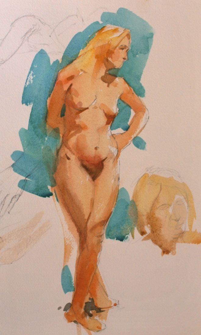
The above is a narrower pastel/watercolor moulding that I’m throwing in because I need to finish it soon. The moulding will be toned to fit the color scheme of the painting, a painting which doesn’t exist yet in this case.  I’m being pre-emptive for once, I guess.


DSC_0016

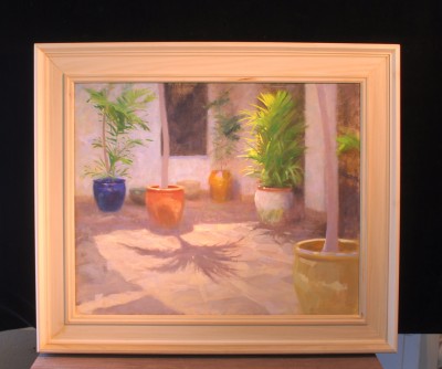
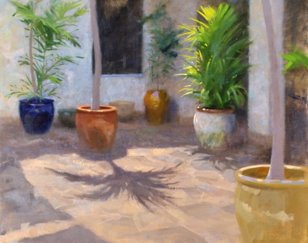
Here’s the unfinished frame and painting together. The frame itself has an inside rabbet measurement of approx. 18.25 x 22 .75″ The 0utside dimension is 23.5 x 27.5″which is a comfortable fit for the picture.

“Quiet Corner-the Palm Courtyard”- completed painting.


Quiet Corner-the Palm Courtyard 600

I’ve gotten this picture to a point where I’m satisfied that it’s a completed work. That is, any more work on it seems counterproductive to the overall effect of the picture.

The underlying idea of the painting, a study of subtleties of color, space, light and shadow, seems resolved.  As it was painted mainly at the location, within the Honolulu Museum of Art’s building complex, I was sometimes surprised a bit by the question “Why did you choose to paint this?”, which I was asked a few times.

For me, it was self evident. Can’t others see how wonderful this is?  But once I considered it,  I can also understand how the people who spend their working days here had naturally become accustomed to it, to the point where there was no longer anything terribly special about it. I have that experience every day in my own workplaces.

Coming to the courtyard with a fresh eye, my answer is that there is something of the sublime in the illumination, the colors of the containers and colors within the shadows; rich, complex grays with violets, blues, and yellows reflecting into them, constantly shifting and shimmering, and the quietness of the physical space.  Maybe it’s only some painters who respond to this sort of thing, but I couldn’t miss it. A quiet corner, indeed, restful and renewing. I’ll never forget the experience of painting here.

“Quiet Corner-the Palm Courtyard”   18 x 22″   oil on linen canvas.


A Figure Drawing with Watercolor Wash

In my Life Drawing Studio class, I sometimes enjoy adding the element of color when the pose is an hour or longer in duration.  Watercolor is a convenient and sometimes ideal way to go…thoughI have to admit that  if the drawing aspect isn’t working,  no amount of color work will make up for such a weakness,  and  so I don’t recommend it to students until they are well on their way.


Watercolor nude 4.13

For anyone who wishes to give it a go, I ‘d recommend starting with monochrome wash until you’ve got a mastery over wash, know your brushes and paper (which need to be of good quality), and especially the drying characteristics of your paper.  I use Arches 140 lb and Saunders 200lb, which are both great papers.

My normal watercolor palette, which is primarily used out-of-doors,  includes the following colors that are perfectly suited for figurative work:

Raw Sienna,  Naples Yellow, Cadmiums Orange, Yellow, Lemon, and Scarlet, Indian Red, Light Red, Alizarin Crimson, Permanent Rose, Raw and Burnt Umbers, and Ivory Black.  These, in  addition to the blues, greens and other colors I regularly employ, are a well rounded group for general painting indoors or out.


“The Palm Courtyard”-getting closer to home

18 x 22″ oil on linen


I’m chipping away at the values and colors of this piece, getting closer to calling it finished. The sessions (about 6 so far) at the Honolulu Museum of Art have been a great pleasure for me, and I’m hopeful of wrapping up my work this week.

Along with clarifying the values,  I’m refining shapes somewhat, keeping lost edges lost,  and especially getting somewhere on the palm that is central to the composition.  Scraped down, repainted; it gets too picky in the details very easily, and I’ve had to take it all down on more than one occasion and redevelop it. The greens are so beautiful in life, I keep re-establishing them to get at some of the richness in the darker areas.  The foreground is only a bit more than layed-in, and doesn’t need too much more to my eye.

A thing suggested…a theme for the whole work maybe.

Whatever color the container in the right hand corner is, it’s beautiful to try and paint…a cool yellow in shadow, always tricky.

I hope to keep this painting light and open in feel, with the just the right amount of mystery… from value adjustments and color touches. It needs to look like paint, and I’m using the old three-part medium in this to get some richness and brushwork evident.


On my easel ~ “The Palm Courtyard”

“The beginner seeks to improve their paintings by adding details.
 The artist does so by refining relationships.”  
 -M.N.
The Palm Courtyard (working title) 18 x 22″ oil on linen

Thanks to the kind generosity of the Honolulu Museum of Art, I’ve been allowed to work on the Museum grounds in this very special location, the Palm Courtyard.

The courtyard  itself is one of several integrated into the Museum’s design, in this instance quite a large area with all sorts of compelling tonal, color, and light/shadow things happening. When I first entered it with an eye towards painting something, it was as if I’d stepped into a life-sized still life arrangement.

Composition ideas often come when I’m looking for “something else”, and this particular  arrangement caught my eye while setting up our model for my class “Painting the Model en Plein Air”.  Perhaps the biggest attraction was the momentary effect of light falling on the large palm  right-of-center (which at this stage of the painting is not yet developed) and the beautiful variety of shapes which I find lead the eye nicely.  Also, the full value range —  from bright, near dazzling light to near darkness…are a big challenge.

The painting is developing slowly…many trips to the location, and as a nice additional bonus, plenty of  interest from Museum visitors and staff alike.  A few have added a brush stroke of their own to the painting at my urging; I believe it’s good to let people experience the process and I enjoy doing so immensely.

As the painting progresses through increasingly subtle adjustments of color, shape, and value, I hope it will capture some of the very quiet richness of this easily overlooked courtyard.  As I stated at the outset, and teach my students,  the artist attempts to improve the work by adjusting relationships.


Tidepool: The Surge

It’s been good to stretch myself out on this large  (unframed size 28 x 36″) Tidepool piece, the first of what may become a series. Painting the unpaintable is what it felt like,.

I relied only on a fairly rough oil sketch and some pencil ideas for the design, which is what most of the painting ended up being about.  From there it’s been a matter of  adjusting things until they looked close to the way I wanted.

I’ve often found it to be a remarkably thoughtful experience to just sit in a place such as this, there are plenty of opportunities to do so in Hawai’i, and take in the indescribable concentration of energy and life that is here.  The colors are wonderful; every sense, really, is able to partake of such an experience, the sound and smells also, even the moisture against one’s skin, and I suppose that it hints at bigger things, questions of creation and how small a thing each one of us, in a sense, is.  All of this beauty and mystery occurs independent of us, whether we notice or not…imagine how much does escape our notice.


So now to practical matters.  I have a couple days to finish work on the frame before it gets hung.  Gallery at Ward Centre, after Friday the 29th, it will be on display. Come see.


A New Portrait Head ~Honolulu Academy School of Art Class

I’ve just finished work on a four-session portrait from a terrific local model, Sergio Janzen. This was done in my class as a demonstration/keep-the-students-enthused  piece.  18 x 14″ oil on stretched linen.

I say study, or even sketch, because there’s only so much one can and should do when students are present, they need help. At the same time I always try to teach by practical example… it’s much better, and certainly humbling, to be struggling with the same problems as they are rather than calling plays from the sidelines with a wine glass in my hand. And if one of the oil painters has a question, I can show them how to work out the answer on my own painting or theirs.  I think that’s an ideal way to learn


Red Sergio oil on linen 18 x 14″


It would have been nice to have had another 3 hours to work out some things on Sergio’s portrait, but I did some of that from memory after the sessions ended. I would rather work from memory in those instances, simply because it keeps me sharper.  I also am driven slightly nuts by the  number of people using cell phone photos to work from away from the model, but they just laugh and call me old  fashioned, which is somewhat true.

But I stick to my guns on this point, because the entire process is not, in the case of the student, to only “finish” a project, but to train their faculties, and one of those faculties involves taking three dimensional reality (nature) and recreating it in two dimensions (upon the canvas) without a machine doing it for them.

My palette was:

Yellow Ochre

Cad Lemon

Cad Orange

Cad Scarlett

Light Red

Flake White #1, with a touch of Liquin worked in

Alizarin Crimson

Viridian

Ultramarine Blue

Ivory Black


Pastel Figure Demonstration en Plein Aire

This is a pastel demonstration piece I executed at Spalding House for my Painting the Model en Plein Aire class last week.

Our topic that day was “Selection and Emphasis”…the idea that one must select from what Nature presents according to your priorities, and then appropriately simplify. Every element must be considered and it’s value to your picture determined, much will  need to be eliminated, and what is left must be simplified and refined.


         Dulce in the Sun      Pastel on Canson       12 x 9″