This is a two session pastel head that I managed to get completed last night in our final “Drawing and Painting the Portrait Head” class at the Honolulu Museum of Art School. The first night was an hour or two of placement of shapes and color, the second session was just moving forward with the whole piece.
Tom, our subject, was new to sitting for portraits, and did a fine job. I’ve found that a model must, perhaps above any other quality, possess some sort of inner life….an intellectual, spiritual dimension to their character that they can exist in during the long and tedious process of sitting. People who require external stimulation to focus on simply won’t be able to do the work for long.
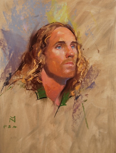
This was the first pastel I’ve done in a while. I used Lascaux pastel ground on a piece of rag mat board, which I then toned with gouache…just stuff lying about my studio! The work was done with my Girault setup and some Stabilo pastel pencils for the smaller passages on the features. I wanted the informal sort of look that I got, nothing fussed over too much, except the drawing (i.e.placement of shapes) and color choices, which I pushed forward as best I could.